Baha Juice
A Better Kind of Refreshment
The soda category hasn't changed in decades. The same artificial flavors, the same synthetic colors, the same guilt that follows every sip. Meanwhile, juice sits on the opposite shelf, healthy but flat, nutritious but boring. Nobody had bridged the gap. BAHA Drink was built to live in that space. One hundred percent real juice. Naturally carbonated. No compromise between what tastes good and what is good. The brief was clear: build a brand that makes healthy feel like a celebration, not a sacrifice.
Premium, But Make It Feel Like Summer
The positioning came first. BAHA needed to feel premium without feeling cold. Tropical without feeling cheap. The reference points weren't other juice brands, they were experiences. A sparkling cider at a rooftop. A cold drink on a Caribbean beach. That moment when something refreshing meets something worth savoring.
The name BAHA carries that energy naturally, warm, confident, and rooted in a sense of place that feels global but intimate at the same time.
The Can as Canvas
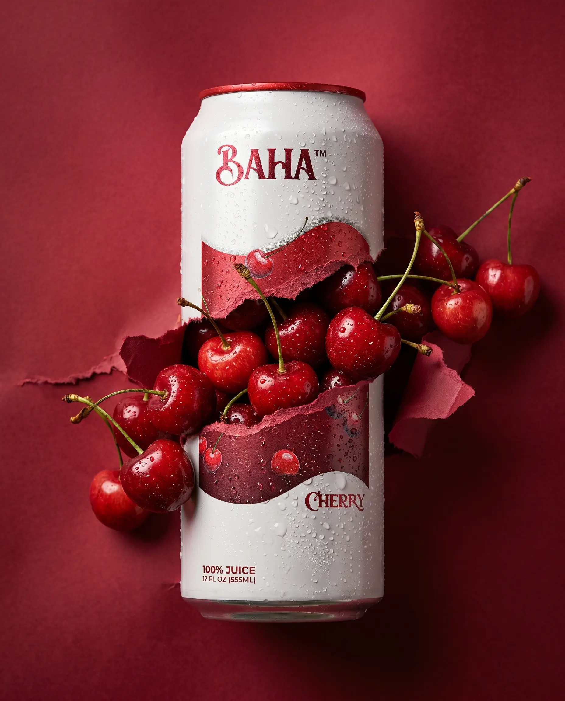
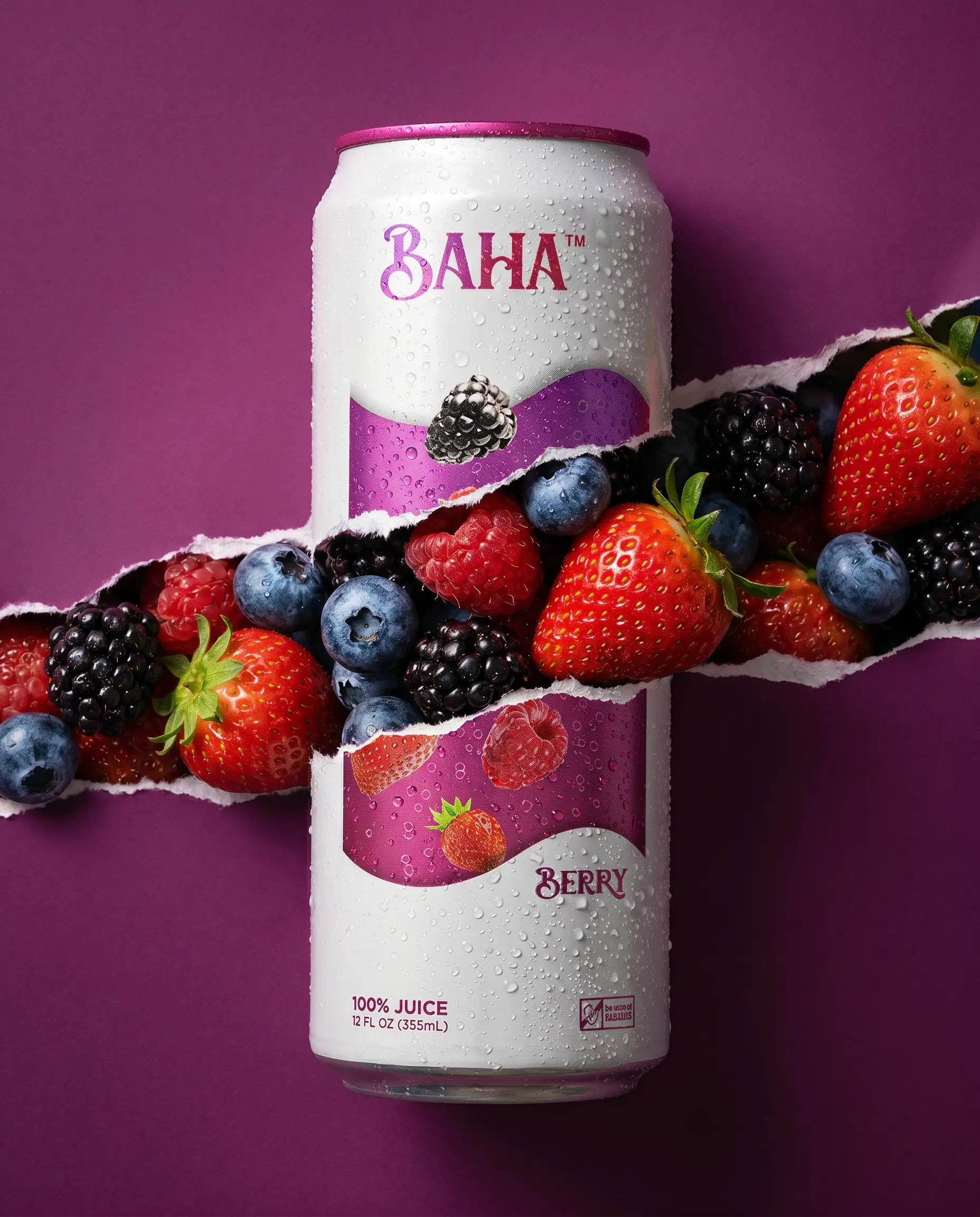
Packaging is where the brand lives first. We chose a tall, clean white can, a deliberate departure from the loud, busy aesthetic that dominates the beverage aisle. White because it communicates purity. Tall because it commands presence.
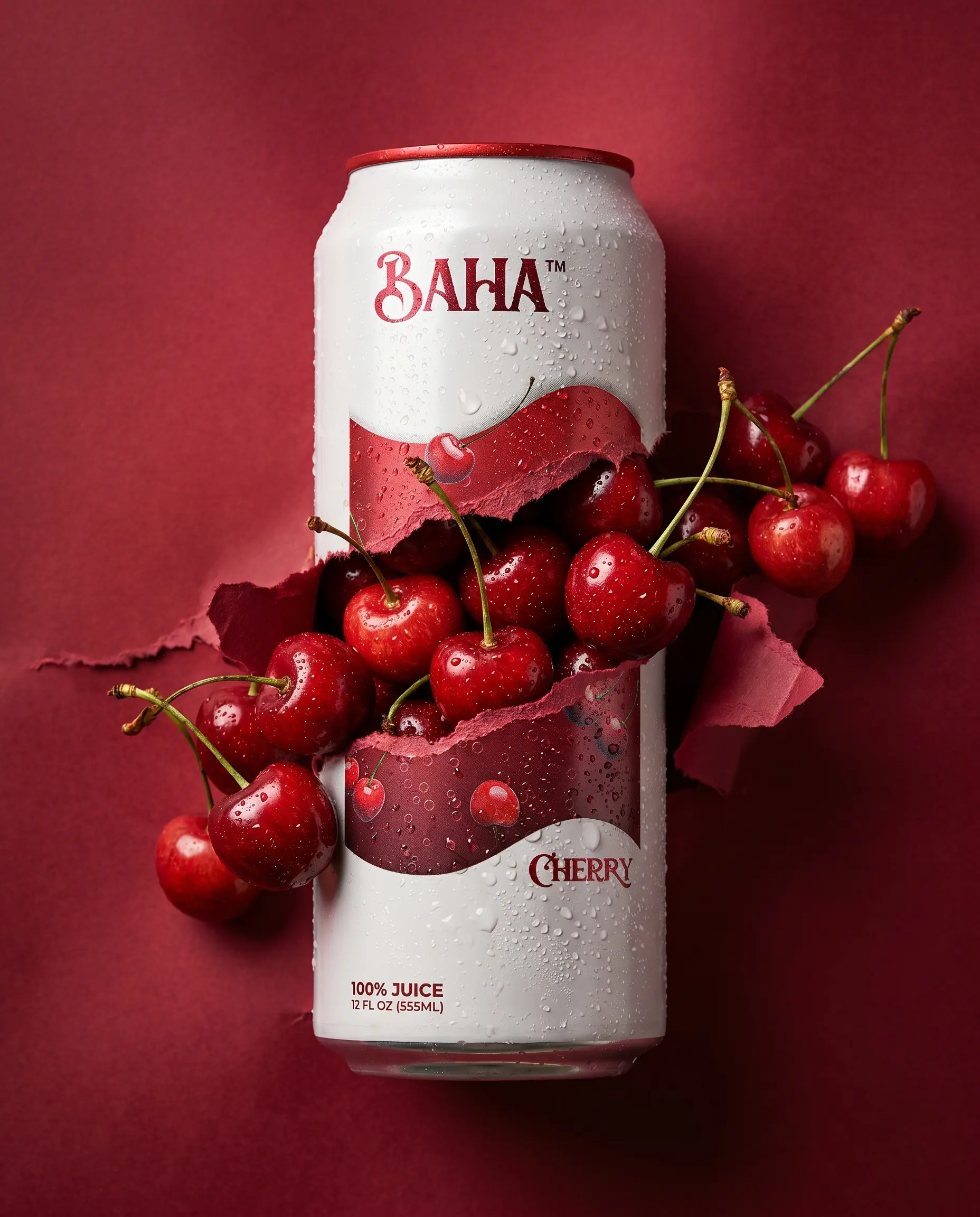
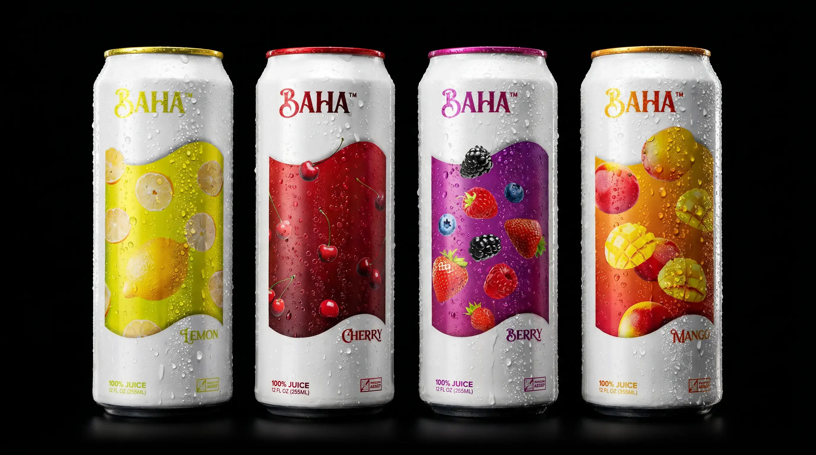
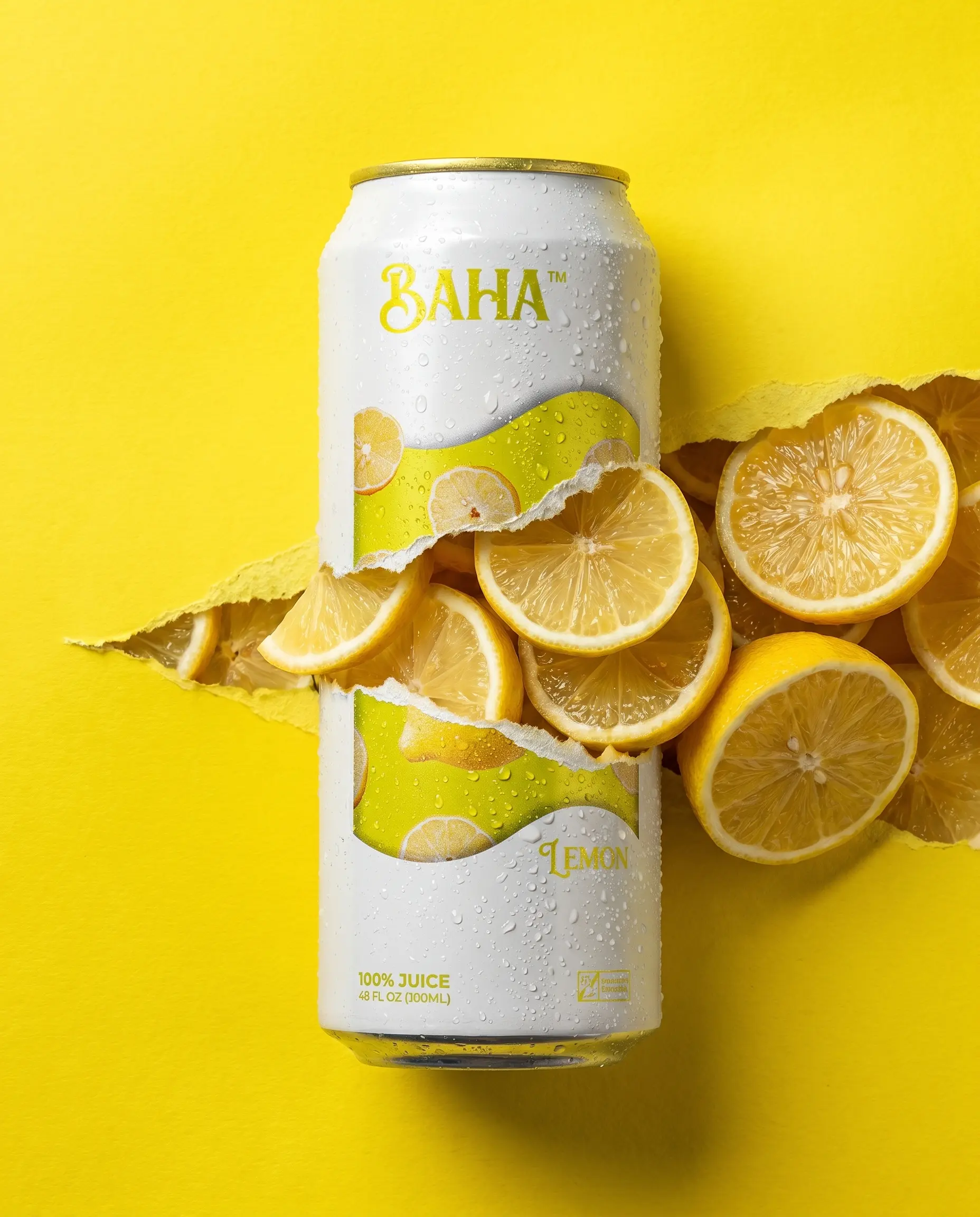
The label design became the brand's most powerful asset. Rather than illustrating flavors generically, each can tells its own story, the actual fruits floating within their own environment, rendered with depth and motion. Mango slices catching light. Cherries glistening with moisture. Berries scattered like they just fell. The can doesn't just label the flavor. It immerses you in it.
Each flavor is its own world. Together they form a system.
Color With Purpose
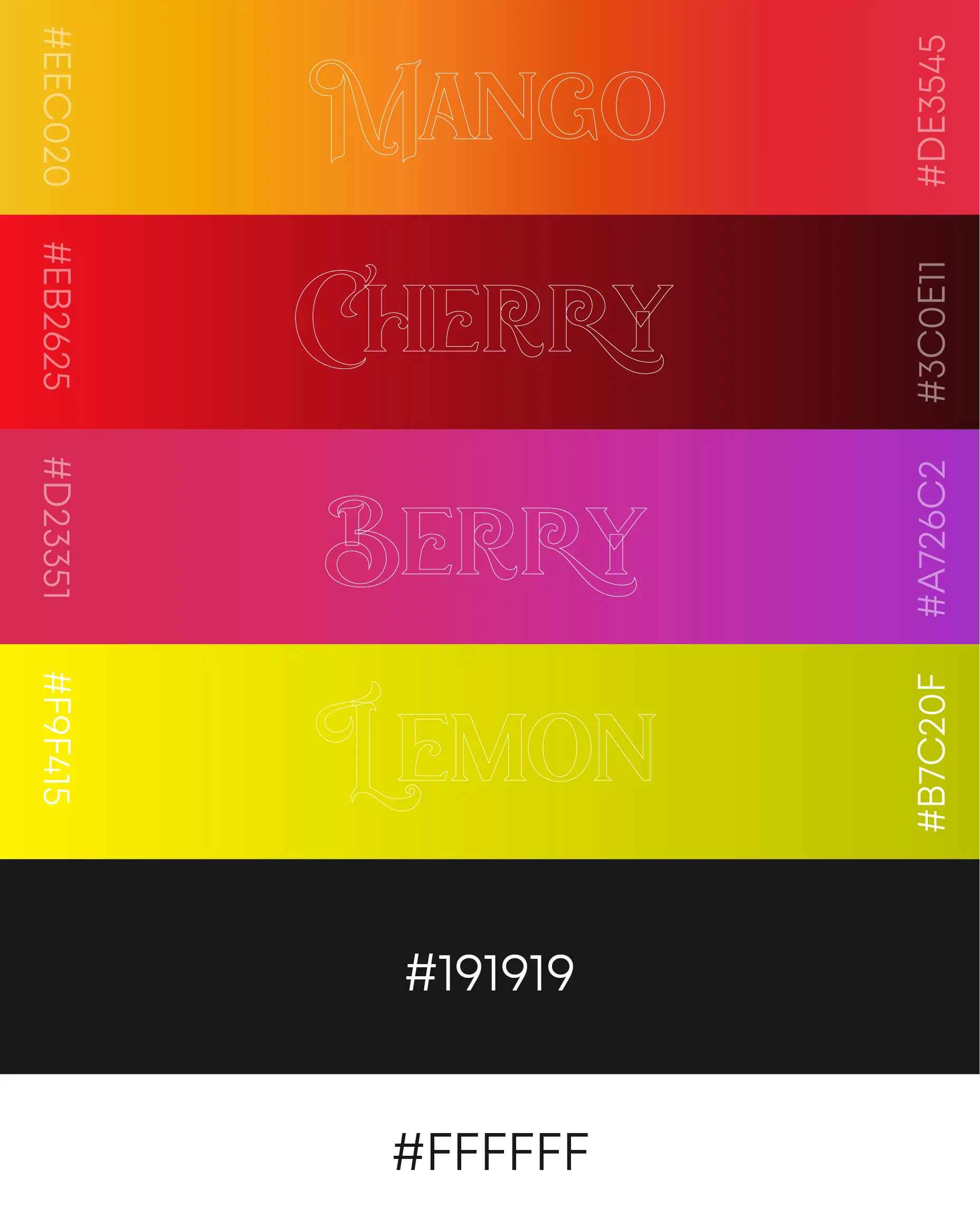
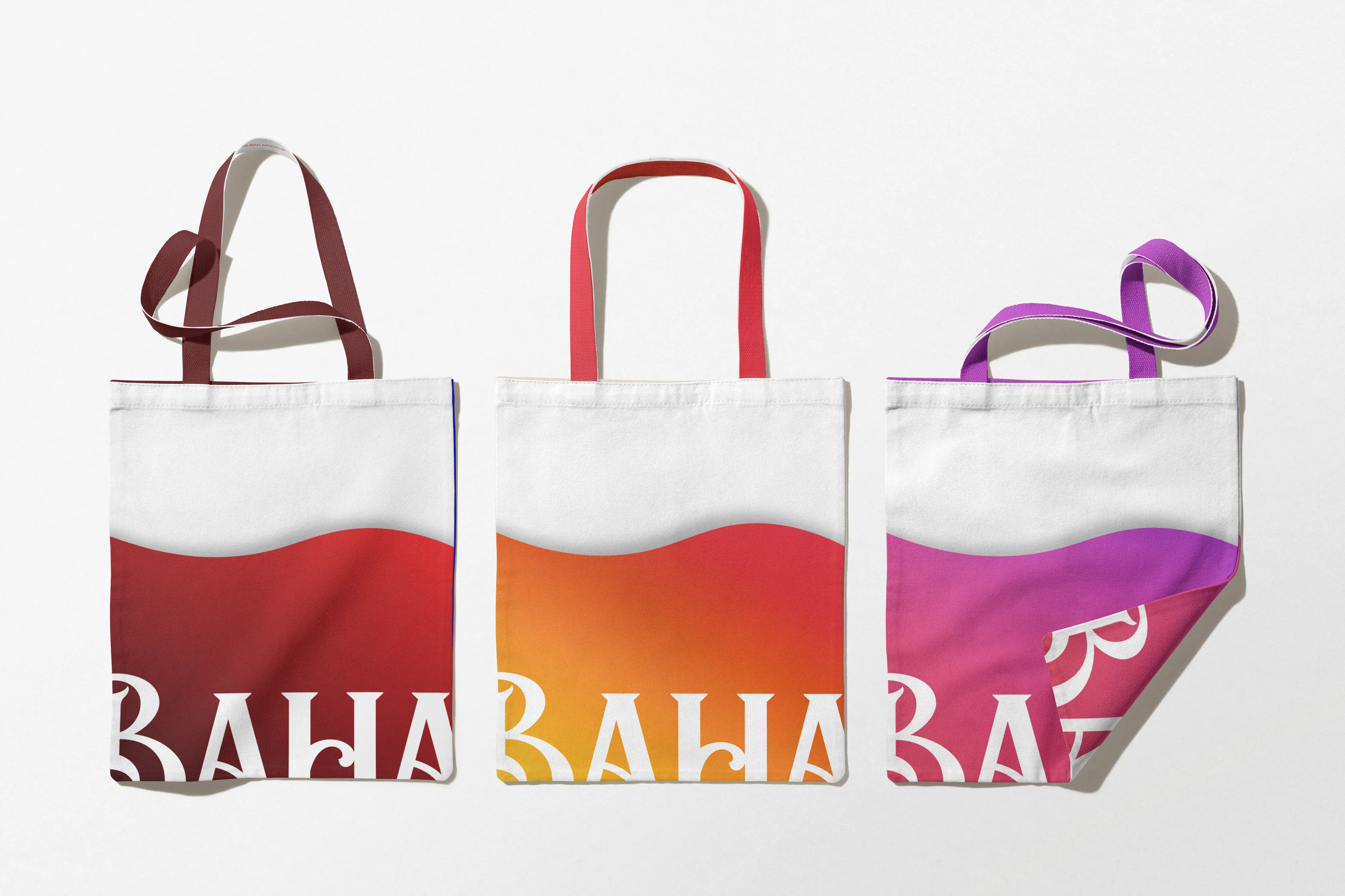
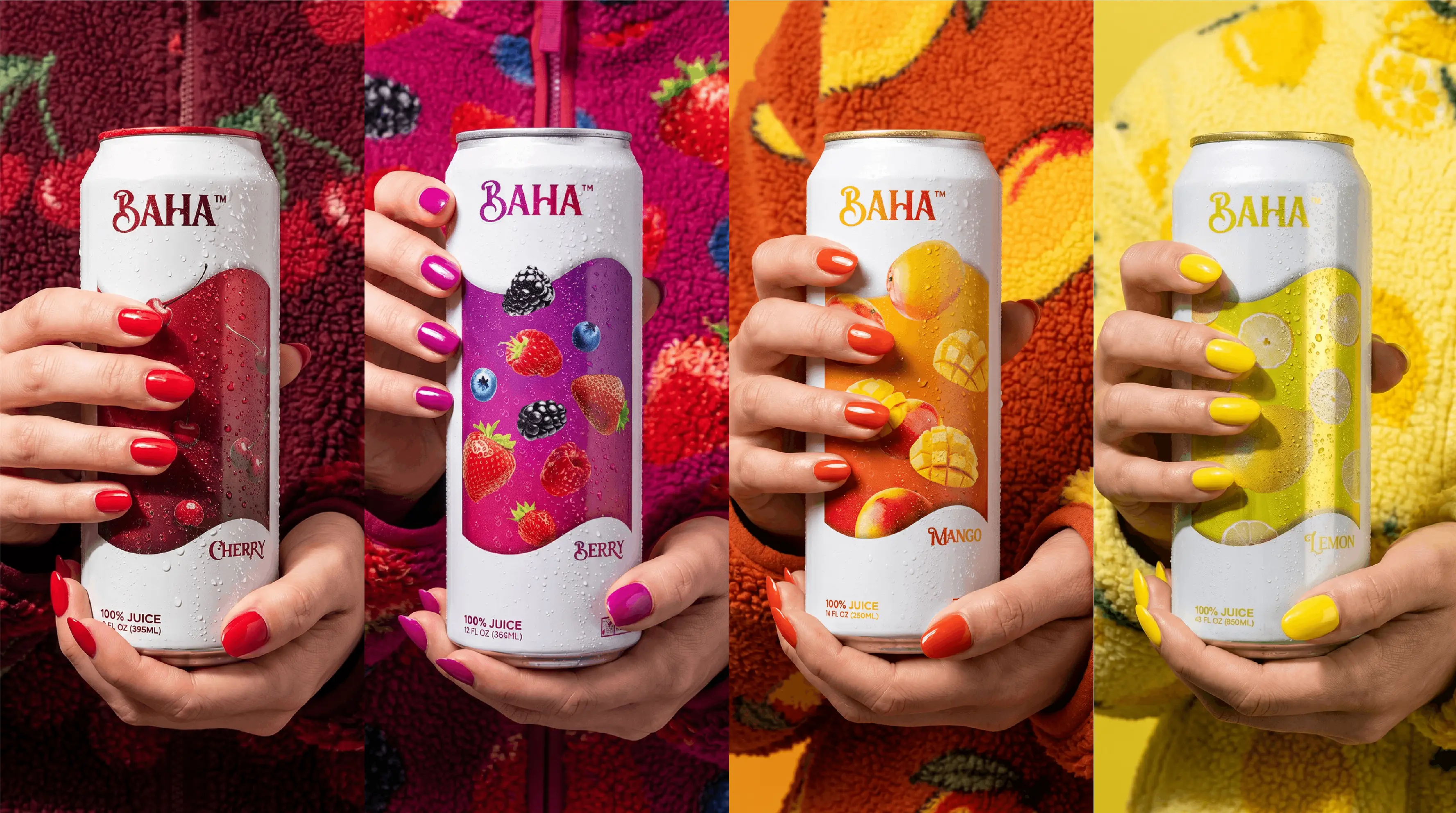
Every color decision was made intentionally. Mango's warm amber and orange communicate warmth and energy. Cherry's deep red signals boldness and indulgence. Lemon's sharp clean yellow cuts through with brightness and clarity. Berry's rich purple carries sophistication and depth.
The colors don't just differentiate the flavors, they create emotional associations that make each can feel like a distinct experience while remaining unmistakably BAHA.
A Brand That Lives in the World
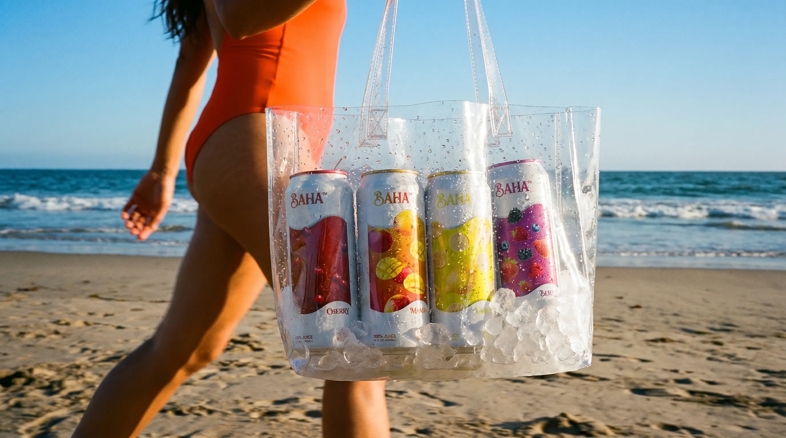
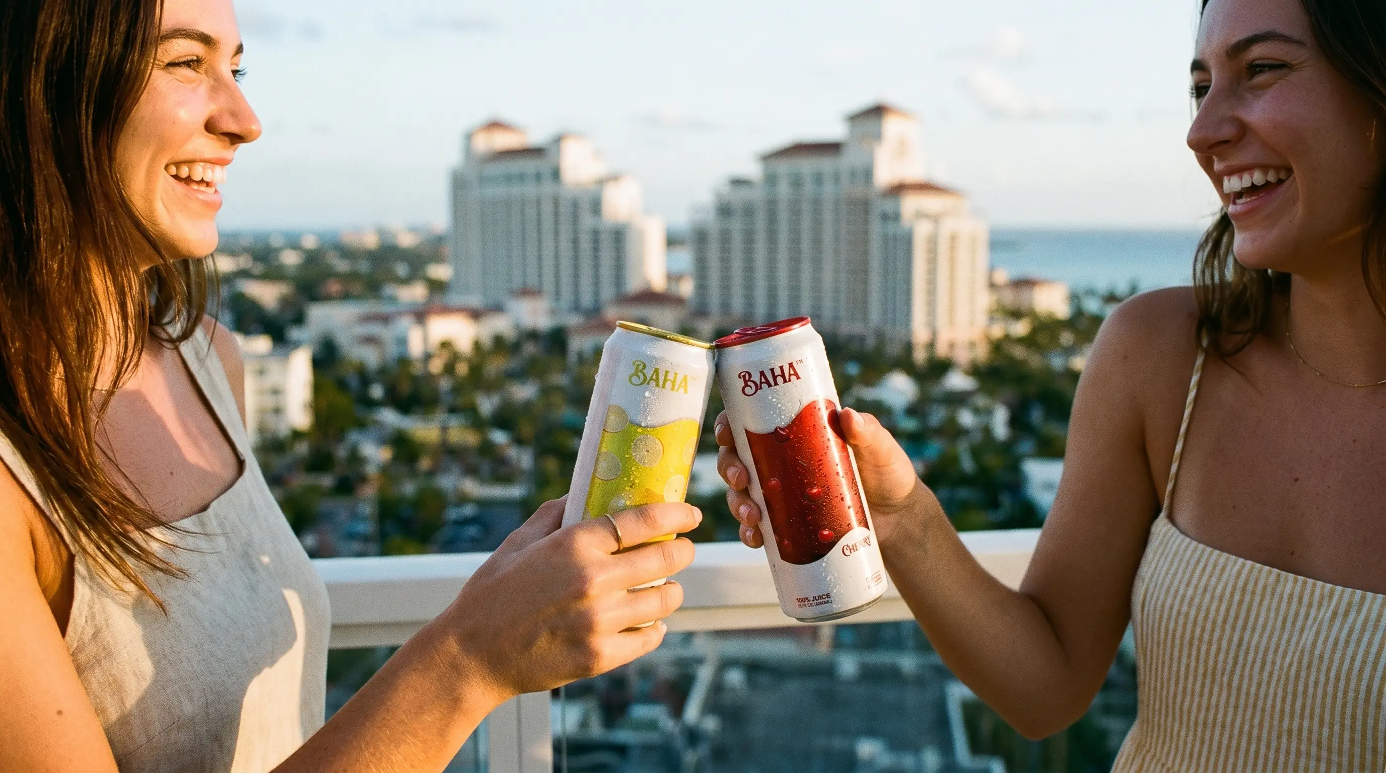
Great packaging is only the beginning. BAHA needed to move, into hands, onto beaches, into the moments where people actually drink it. The art direction followed the same philosophy as the packaging, premium but alive. Aspirational but accessible.
Each flavor was paired with a corresponding visual world. The outfit, the environment, the light, everything matched the emotional temperature of the flavor it carried. Nothing accidental. Every frame considered.
The result is a brand that doesn't just sit on a shelf. It belongs to a lifestyle.
Beyond the Glass
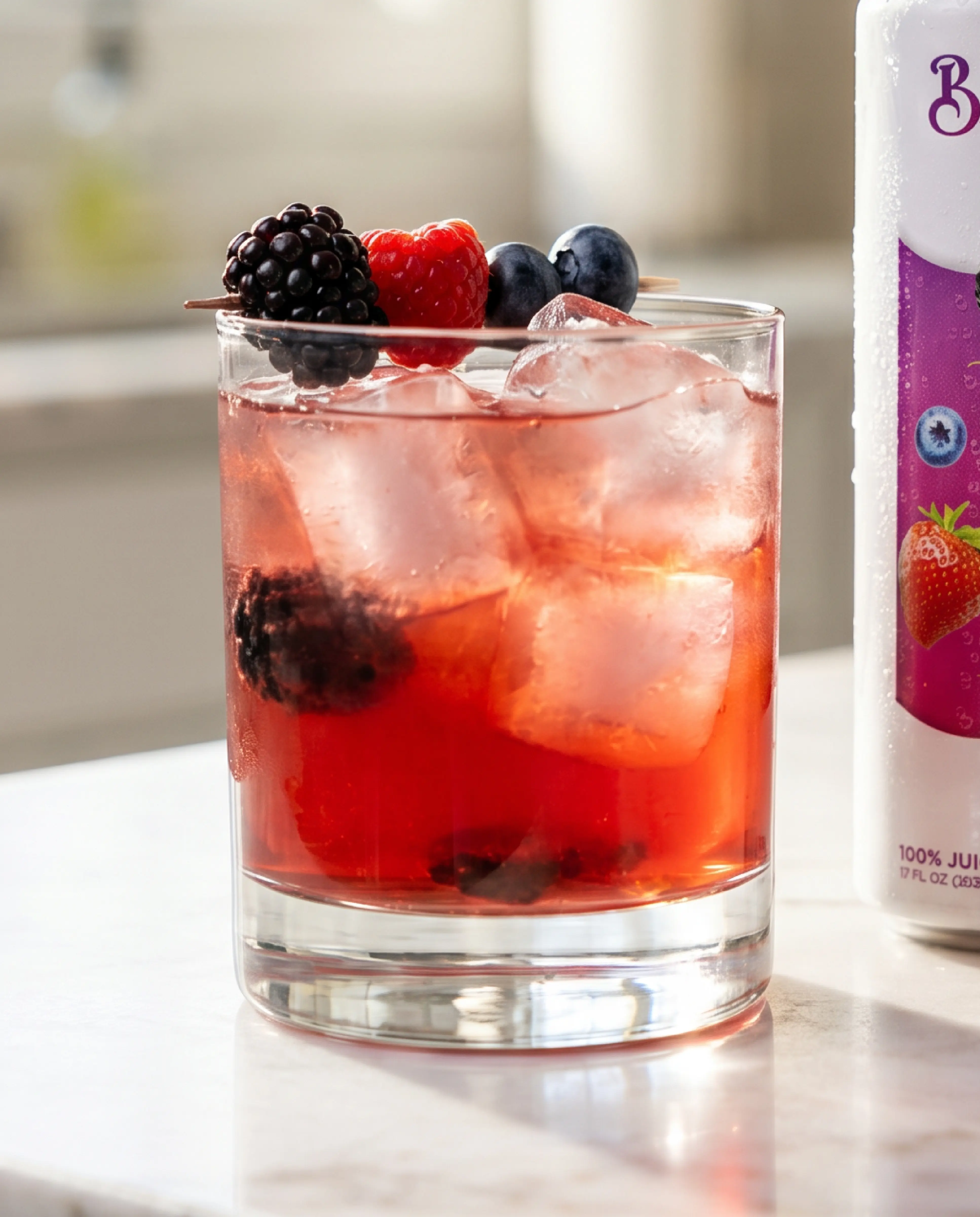
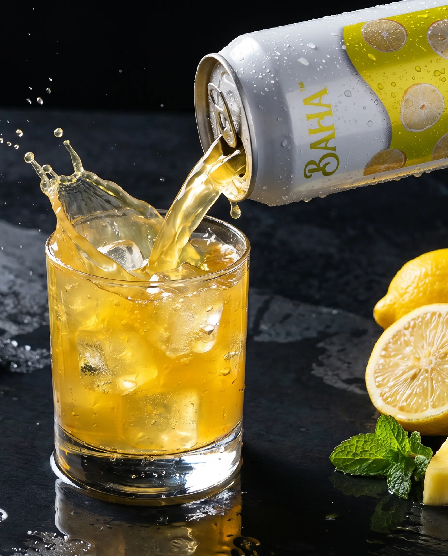
BAHA Drink's versatility extends beyond drinking it straight. The natural carbonation and 100% juice base make it a premium mixer, a sophisticated base for cocktails that don't require compromise. That dimension of the brand opens it to a broader cultural conversation, one that lives at the intersection of wellness and indulgence, wherever people choose to celebrate.
The Outcome
Four flavors. One cohesive system. A brand built to compete globally from day one, premium enough for high-end retail, vibrant enough to move culture, and grounded enough in real ingredients to earn lasting trust.
BAHA Drink doesn't follow the category. It redefines what refreshment looks like.
The brief wasn't to design a drink. It was to design a feeling.
Creative Direction by Devante Butler
Premium, But Make It Feel Like Summer
The positioning came first. BAHA needed to feel premium without feeling cold. Tropical without feeling cheap. The reference points weren't other juice brands, they were experiences. A sparkling cider at a rooftop. A cold drink on a Caribbean beach. That moment when something refreshing meets something worth savoring.
The name BAHA carries that energy naturally, warm, confident, and rooted in a sense of place that feels global but intimate at the same time.
The Can as Canvas
Packaging is where the brand lives first. We chose a tall, clean white can, a deliberate departure from the loud, busy aesthetic that dominates the beverage aisle. White because it communicates purity. Tall because it commands presence.
The label design became the brand's most powerful asset. Rather than illustrating flavors generically, each can tells its own story, the actual fruits floating within their own environment, rendered with depth and motion. Mango slices catching light. Cherries glistening with moisture. Berries scattered like they just fell. The can doesn't just label the flavor. It immerses you in it.
Each flavor is its own world. Together they form a system.
Color With Purpose
Every color decision was made intentionally. Mango's warm amber and orange communicate warmth and energy. Cherry's deep red signals boldness and indulgence. Lemon's sharp clean yellow cuts through with brightness and clarity. Berry's rich purple carries sophistication and depth.
The colors don't just differentiate the flavors, they create emotional associations that make each can feel like a distinct experience while remaining unmistakably BAHA.
A Brand That Lives in the World
Great packaging is only the beginning. BAHA needed to move, into hands, onto beaches, into the moments where people actually drink it. The art direction followed the same philosophy as the packaging, premium but alive. Aspirational but accessible.
Each flavor was paired with a corresponding visual world. The outfit, the environment, the light, everything matched the emotional temperature of the flavor it carried. Nothing accidental. Every frame considered.
The result is a brand that doesn't just sit on a shelf. It belongs to a lifestyle.
Beyond the Glass
BAHA Drink's versatility extends beyond drinking it straight. The natural carbonation and 100% juice base make it a premium mixer, a sophisticated base for cocktails that don't require compromise. That dimension of the brand opens it to a broader cultural conversation, one that lives at the intersection of wellness and indulgence, wherever people choose to celebrate.
The Outcome
Four flavors. One cohesive system. A brand built to compete globally from day one, premium enough for high-end retail, vibrant enough to move culture, and grounded enough in real ingredients to earn lasting trust.
BAHA Drink doesn't follow the category. It redefines what refreshment looks like.
The brief wasn't to design a drink. It was to design a feeling.
Creative Direction by Devante Butler
dark
Outcome
The landing page improved first-screen comprehension and reduced friction in the path to sign up.
- +28% click-through on the primary CTA in the hero
- +19% time on page for visitors from ads
- −24% bounce on mobile
“Clean, fast, and exactly the tone we wanted. The new page finally explains Auralis without getting in the way.”
Services delivered
Website design, UI/UX design, visual direction, interaction design, design system setup, hand-off docs.
Tools
Figma for design and prototyping, Webflow for build, lightweight motion for micro-interactions.
.png)
More Cases
.webp)