.webp)
Hack <iT> Stem Camp
Where Innovation Meets Identity
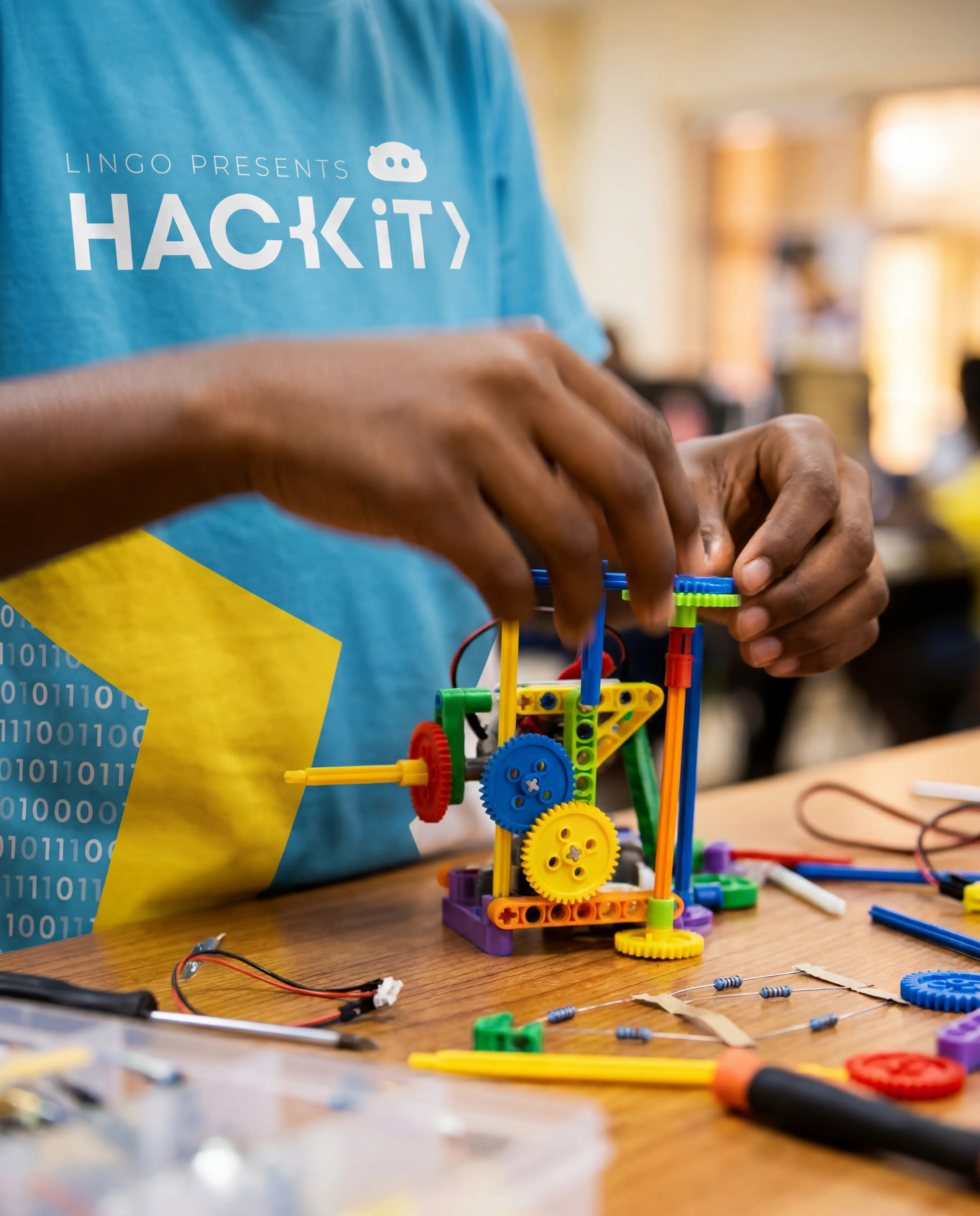
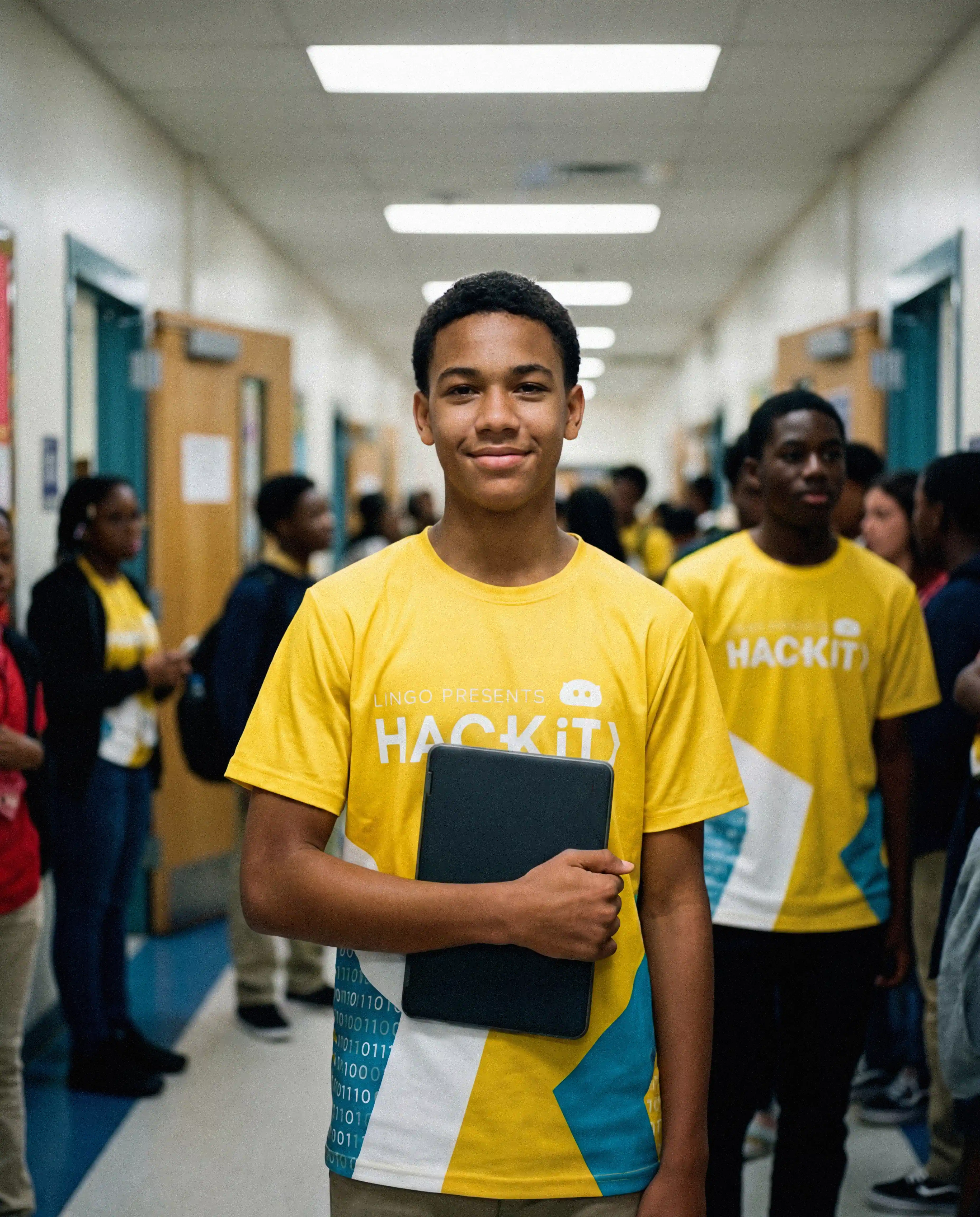
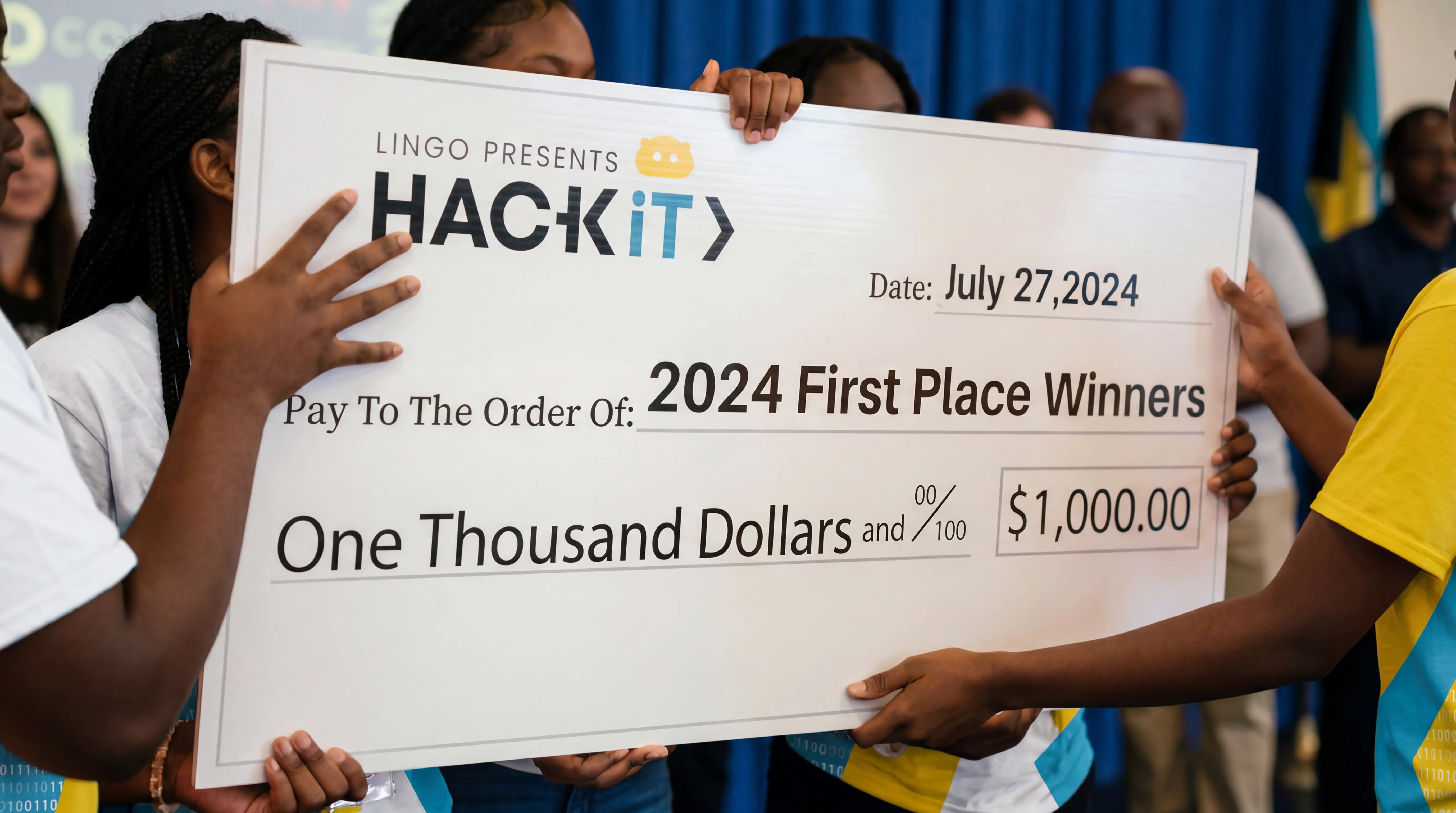
Hack IT Bahamas is not a typical summer camp. It is a movement. Founded by Aisha Bowe, the first Bahamian to reach outer space, the program exists to show young Bahamians that the ceiling does not exist, that a kid from Nassau can become a NASA rocket scientist, a Blue Origin astronaut, and a global force for change. The brand needed to carry that weight without losing the energy and excitement that makes the camp magnetic to young people.
The brief was to reimagine the visual identity of a program that had already made international headlines and give it a design system worthy of its founder's legacy.
Building a Brand as Bold as the Mission
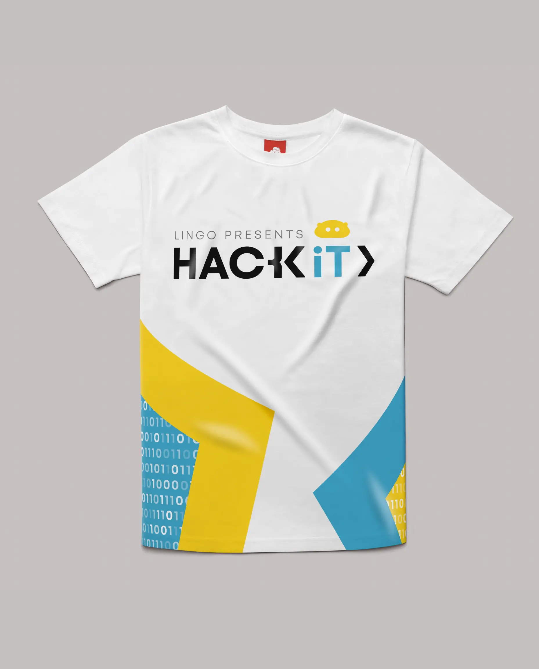
The work began with the logo. The redesign had to balance two things that rarely sit comfortably together the precision and authority of a STEM institution and the vibrant, energetic spirit of a youth program. Too corporate and it loses the young audience. Too playful and it loses the institutional credibility that comes with having a NASA-trained founder.
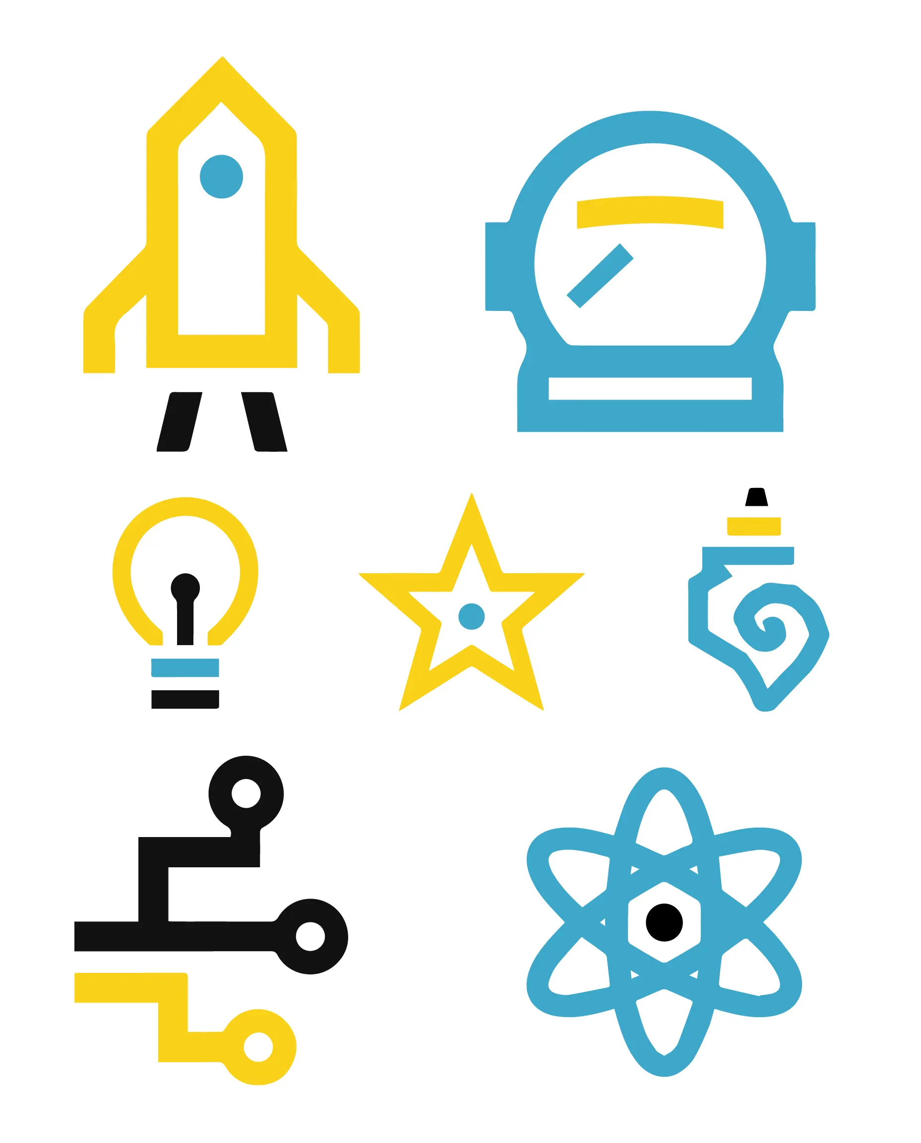
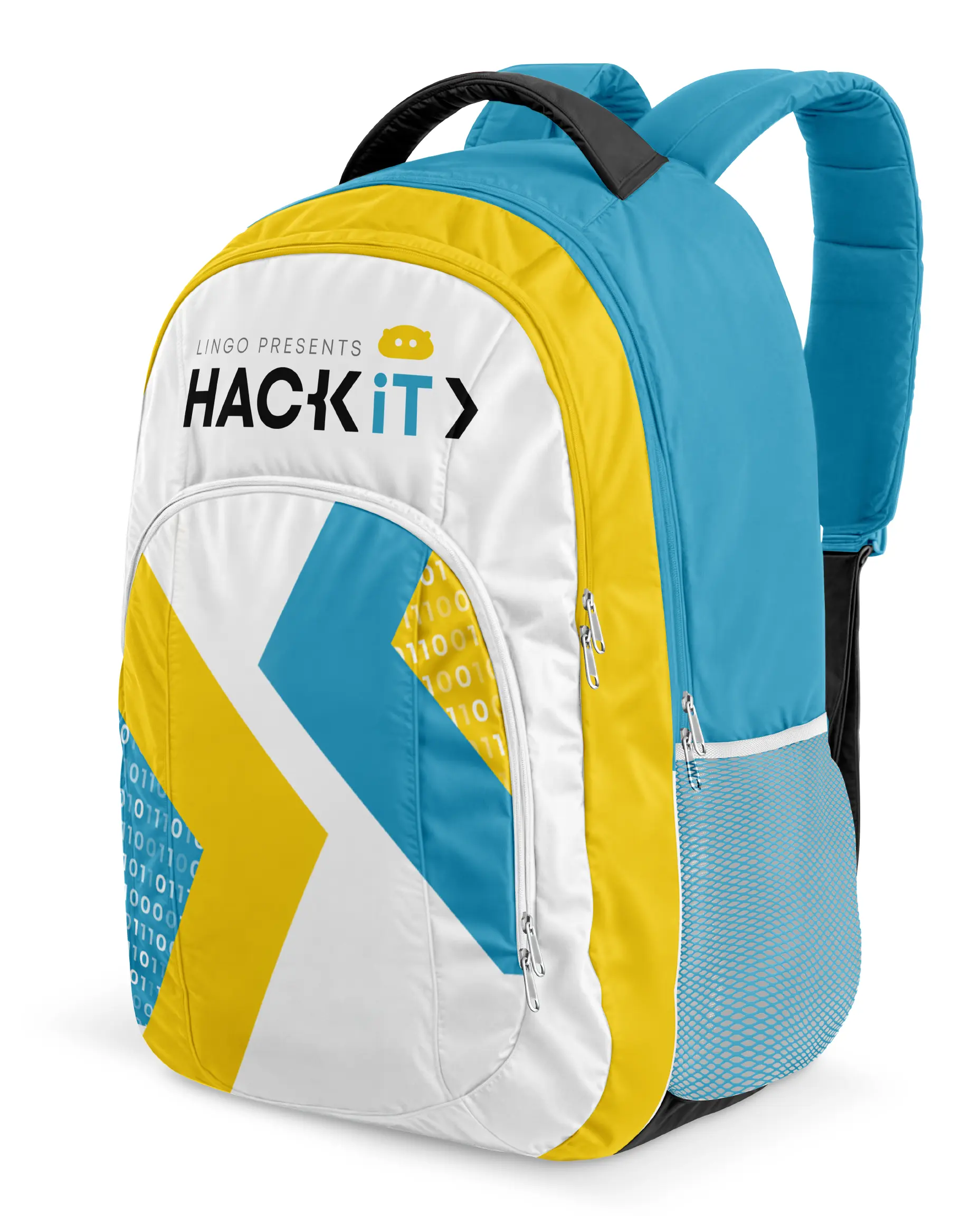
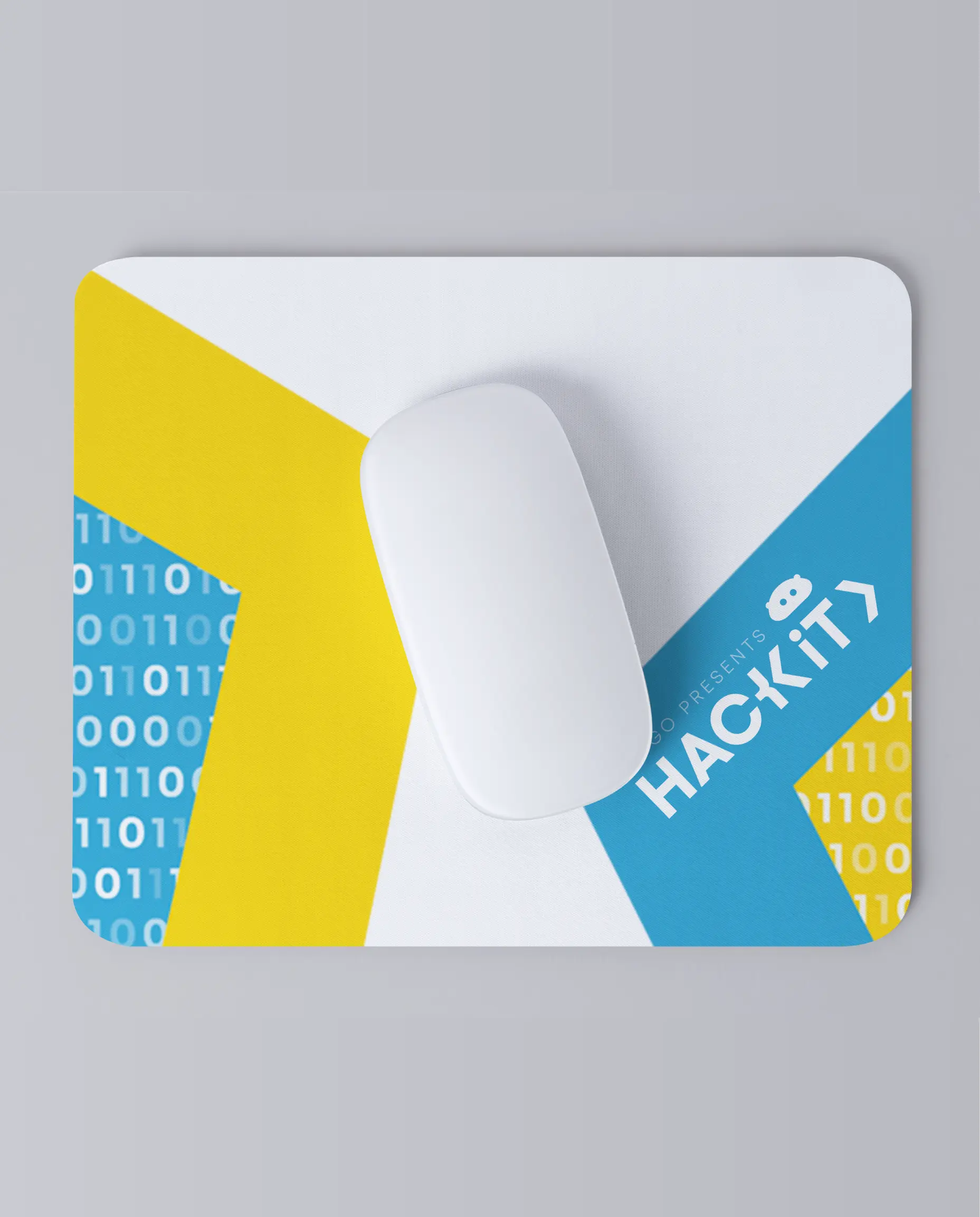
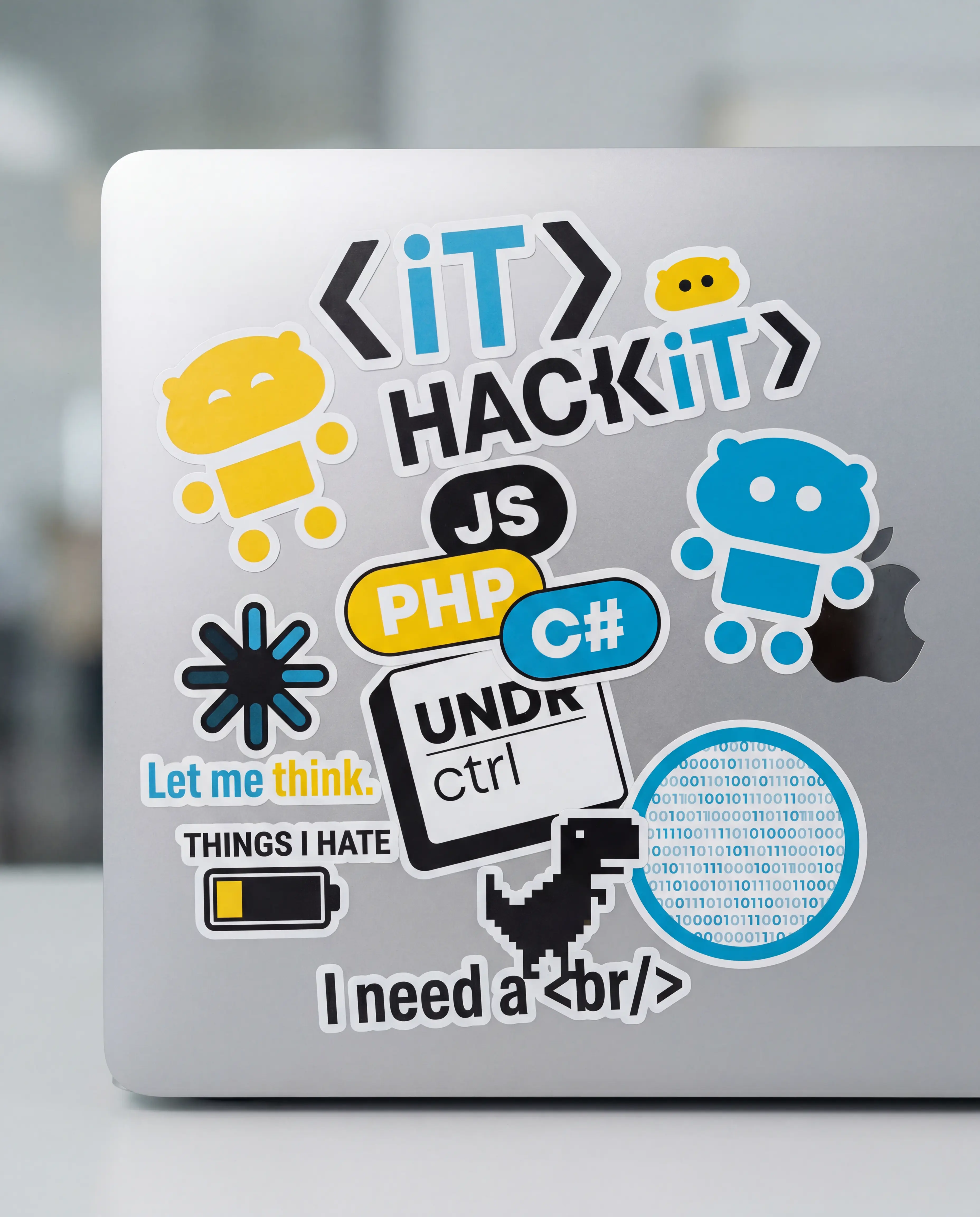
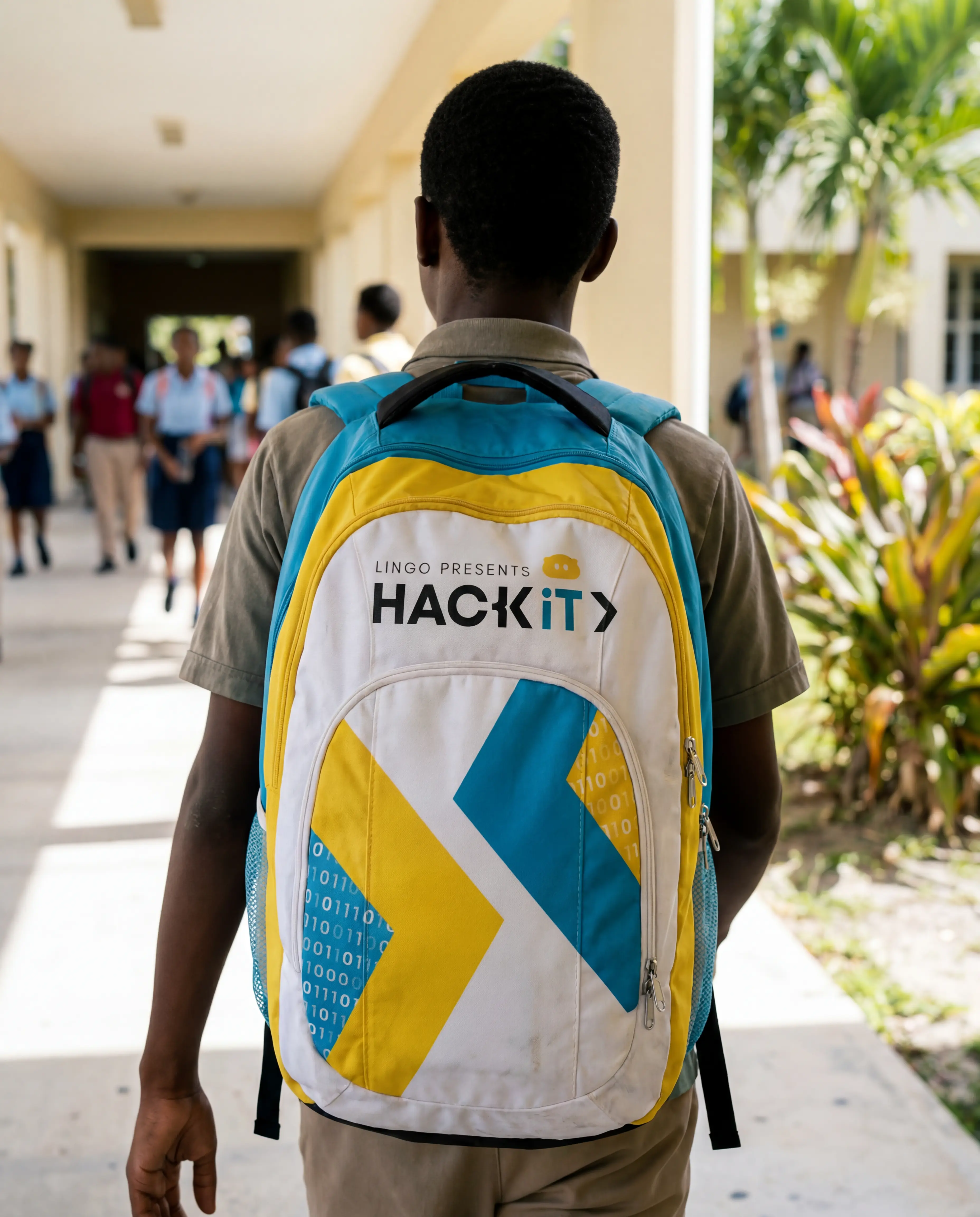
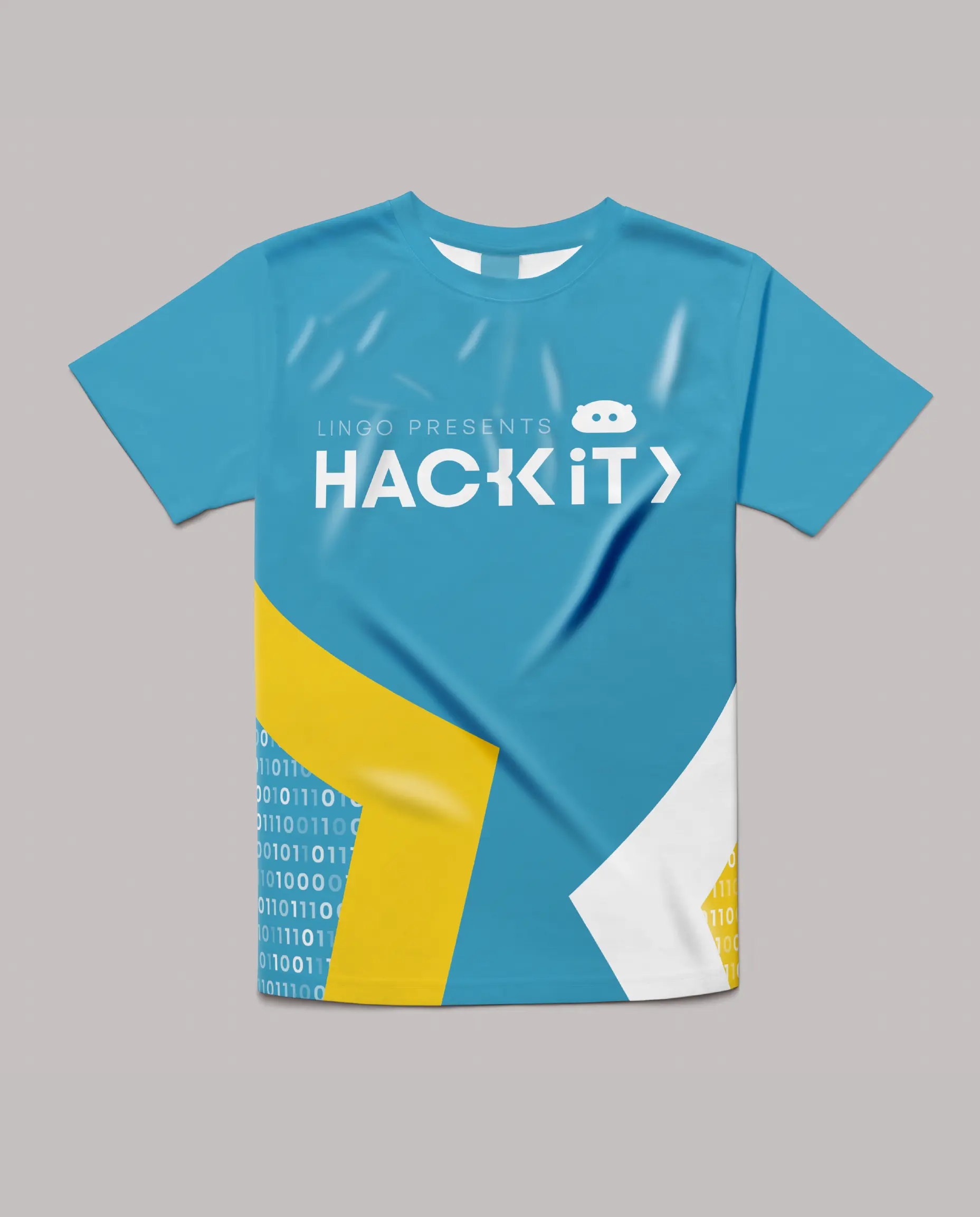
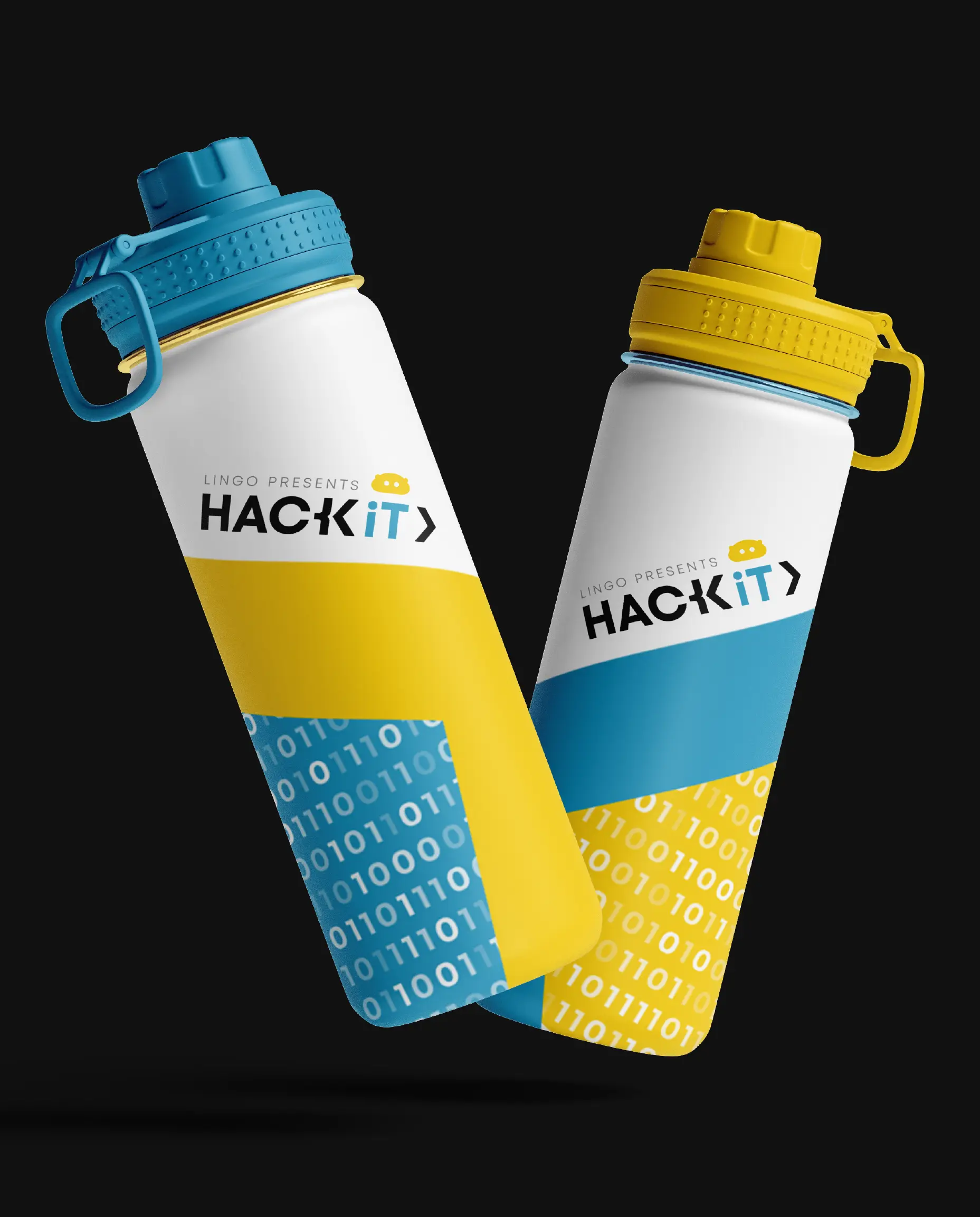
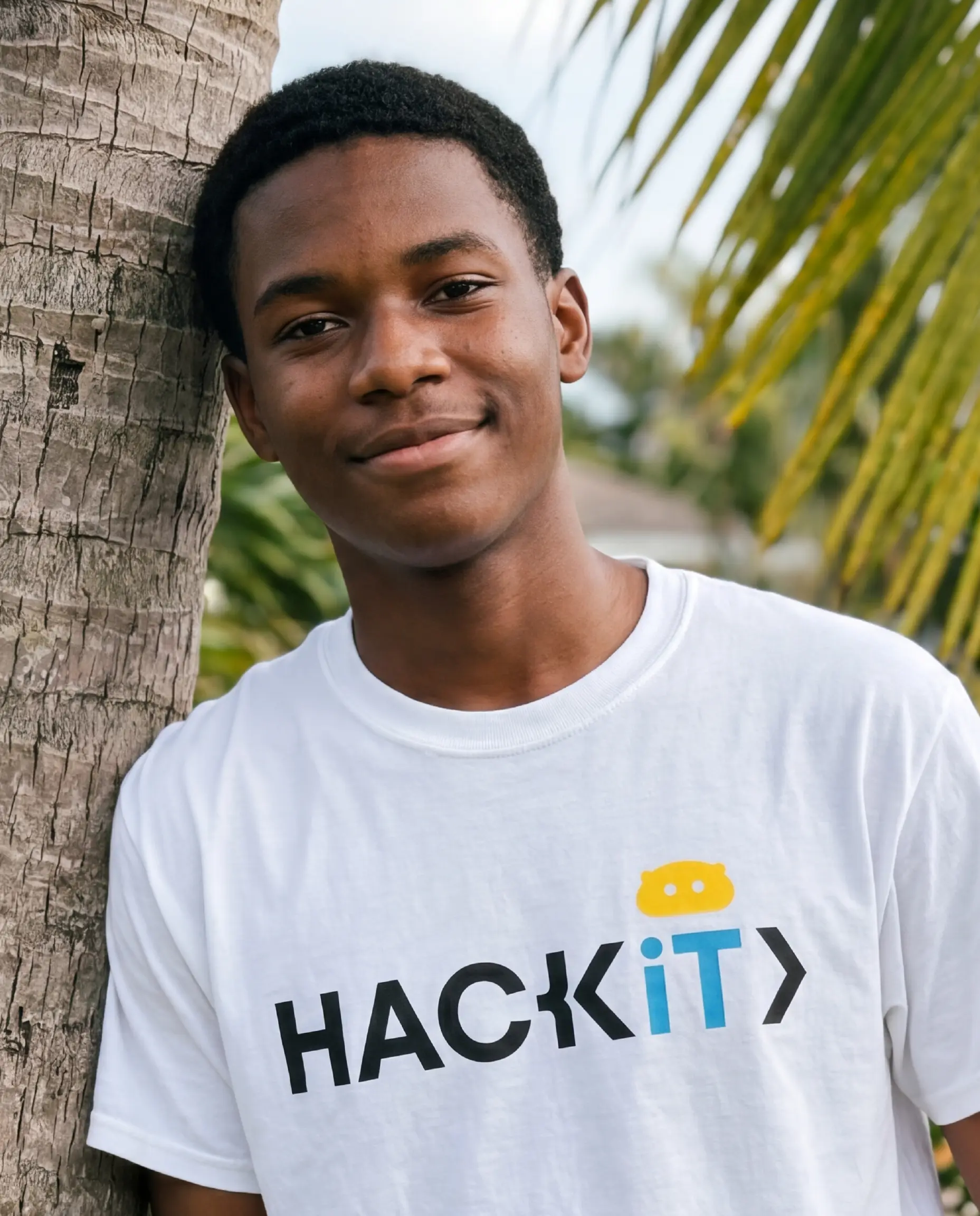
The solution was a brand identity that felt futuristic and grounded simultaneously. The color system, the custom pattern, and the typography were built to communicate innovation and ambition without alienating the students the camp exists to inspire.
Motion as a Communication Tool
The lower thirds and countdown graphics brought the brand into live and broadcast environments. Motion graphics for an event of this nature have one job they need to command attention on a screen in a room full of energetic young people. Every animation was built to feel sharp, modern, and aligned with the visual language of the broader identity. The brand did not just appear on screen. It performed.
A Social Media Presence Built for Impact
The social media branding, flyers, and countdown graphics extended the identity across every platform where the camp lives in public. Consistency across these touchpoints meant that whether someone encountered Hack IT on Facebook, Instagram, or in a printed flyer, they were meeting the same brand one that looked like it belonged on the international stage, because it does.
The Outcome
A complete brand system for one of the most significant youth education initiatives in the Bahamas, built around a founder whose story has captured international attention. The rebrand gave Hack IT Bahamas a visual identity that can grow with the program as its reach expands and its impact deepens.
This is what it looks like when design serves a mission that matters.
The brief was to reimagine the visual identity of a program that had already made international headlines and give it a design system worthy of its founder's legacy.
Building a Brand as Bold as the Mission
The work began with the logo. The redesign had to balance two things that rarely sit comfortably together the precision and authority of a STEM institution and the vibrant, energetic spirit of a youth program. Too corporate and it loses the young audience. Too playful and it loses the institutional credibility that comes with having a NASA-trained founder.
The solution was a brand identity that felt futuristic and grounded simultaneously. The color system, the custom pattern, and the typography were built to communicate innovation and ambition without alienating the students the camp exists to inspire.
Motion as a Communication Tool
The lower thirds and countdown graphics brought the brand into live and broadcast environments. Motion graphics for an event of this nature have one job they need to command attention on a screen in a room full of energetic young people. Every animation was built to feel sharp, modern, and aligned with the visual language of the broader identity. The brand did not just appear on screen. It performed.
A Social Media Presence Built for Impact
The social media branding, flyers, and countdown graphics extended the identity across every platform where the camp lives in public. Consistency across these touchpoints meant that whether someone encountered Hack IT on Facebook, Instagram, or in a printed flyer, they were meeting the same brand one that looked like it belonged on the international stage, because it does.
The Outcome
A complete brand system for one of the most significant youth education initiatives in the Bahamas, built around a founder whose story has captured international attention. The rebrand gave Hack IT Bahamas a visual identity that can grow with the program as its reach expands and its impact deepens.
This is what it looks like when design serves a mission that matters.
dark
Outcome
The landing page improved first-screen comprehension and reduced friction in the path to sign up.
- +28% click-through on the primary CTA in the hero
- +19% time on page for visitors from ads
- −24% bounce on mobile
“Clean, fast, and exactly the tone we wanted. The new page finally explains Auralis without getting in the way.”
Services delivered
Website design, UI/UX design, visual direction, interaction design, design system setup, hand-off docs.
Tools
Figma for design and prototyping, Webflow for build, lightweight motion for micro-interactions.
.webp)
.webp)
More Cases