The Mental Health Programming Unit
A Nation That Needs to Talk
The Mental Health Programming Unit operates within the Ministry of Health and Wellness, working alongside the Pan American Health Organization, the Public Hospitals Authority, and the Bahamas Psychological Association to address key issues in mental health and wellness across the Bahamas. Over the last ten years there has been a documented increase in the incidence of patients suffering from signs and symptoms of mental illness across the country, sparking important conversations about mental health care and its effectiveness
The unit needed a brand that could meet that moment. Not clinical. Not cold. Not the generic imagery of a brain or a head that mental health design so often defaults to. Something that felt human, approachable, and grounded in what mental health programming actually is at its core.
The Insight Everything Is Connection
After extensive research and deliberate design exploration, one theme emerged above everything else: connection.
Mental health programming is teaching. Teaching is connecting knowledge. The Ministry's work connects the gap between physical and mental health. Within mental illness itself, connections are everywhere perfectionism and anxiety intertwined, depression and negative thought patterns coalescing, stress and physical health bearing a direct relationship, substance abuse and coping mechanisms forming a crucial junction on the path to recovery. Even at the neurological level, thought itself is a cascade of connections between brain cells.
The fundamental objective of this unit is to foster and emphasize those connections within the organization, across leadership, among public workers, and throughout the entire Bahamian community. The brand was built around that truth.
The Identity
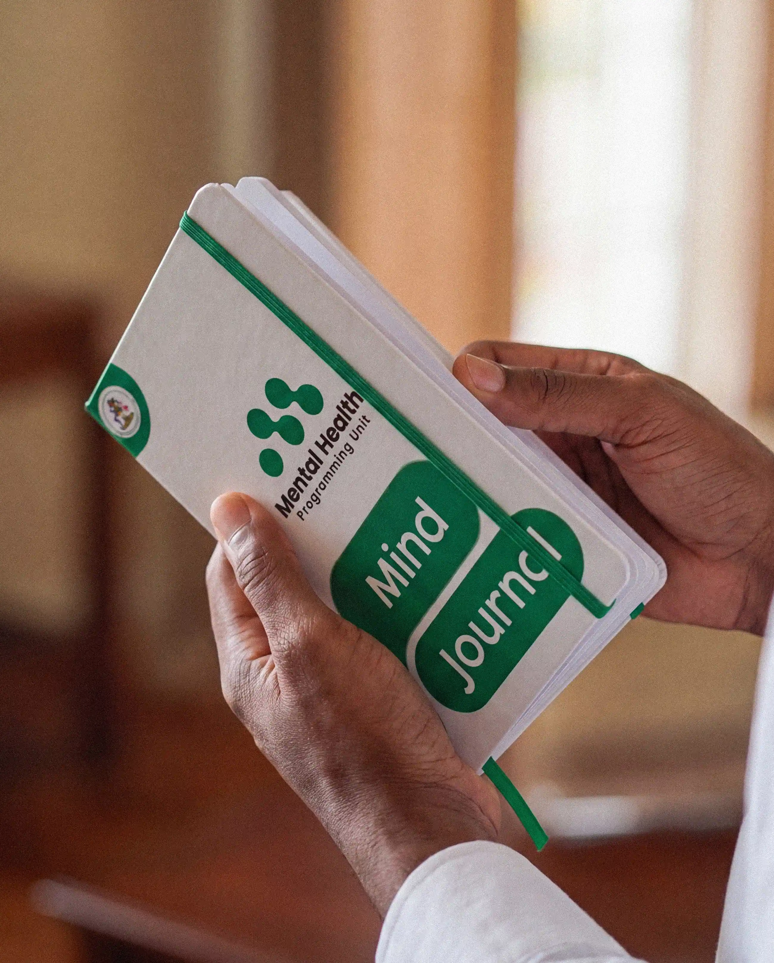
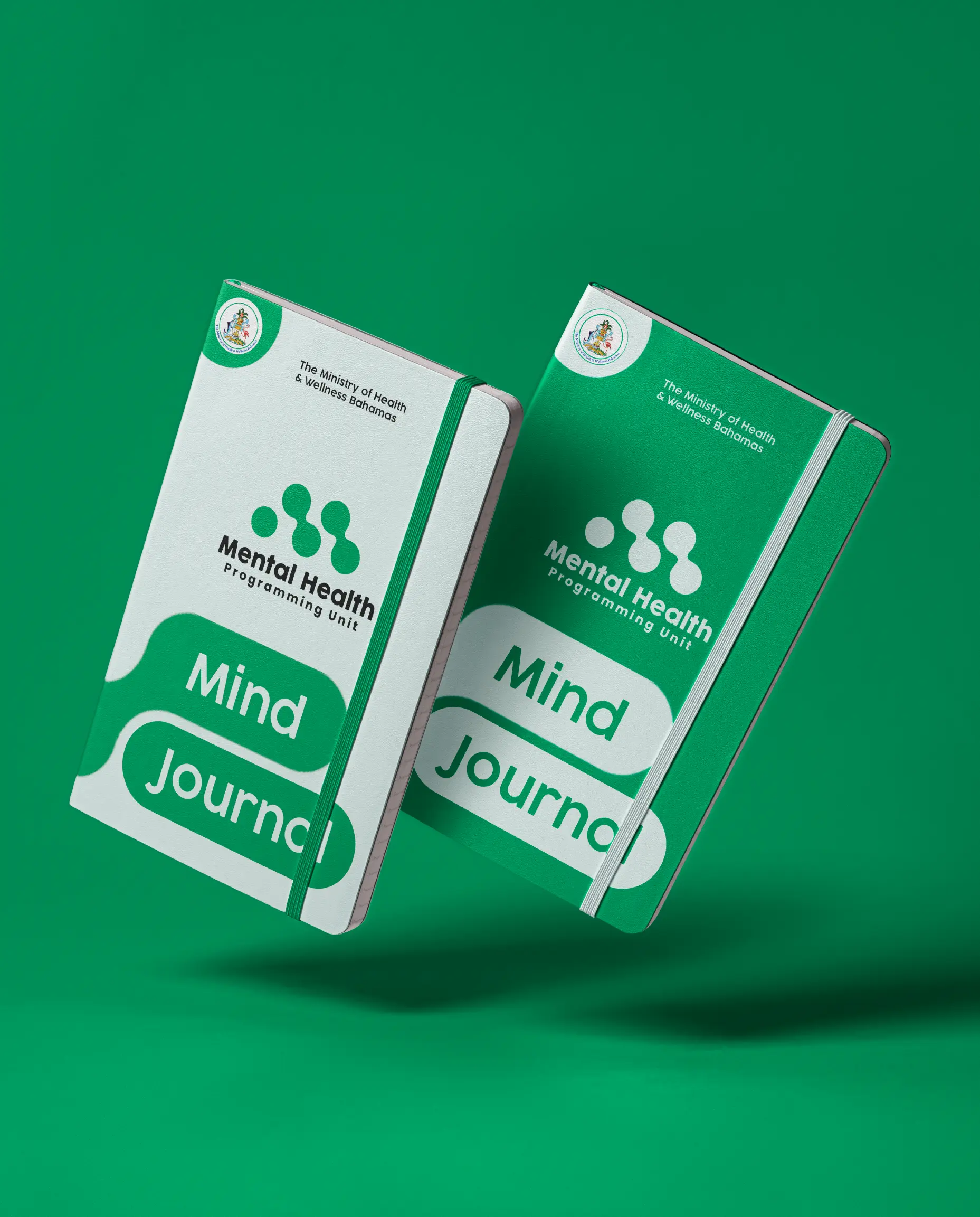
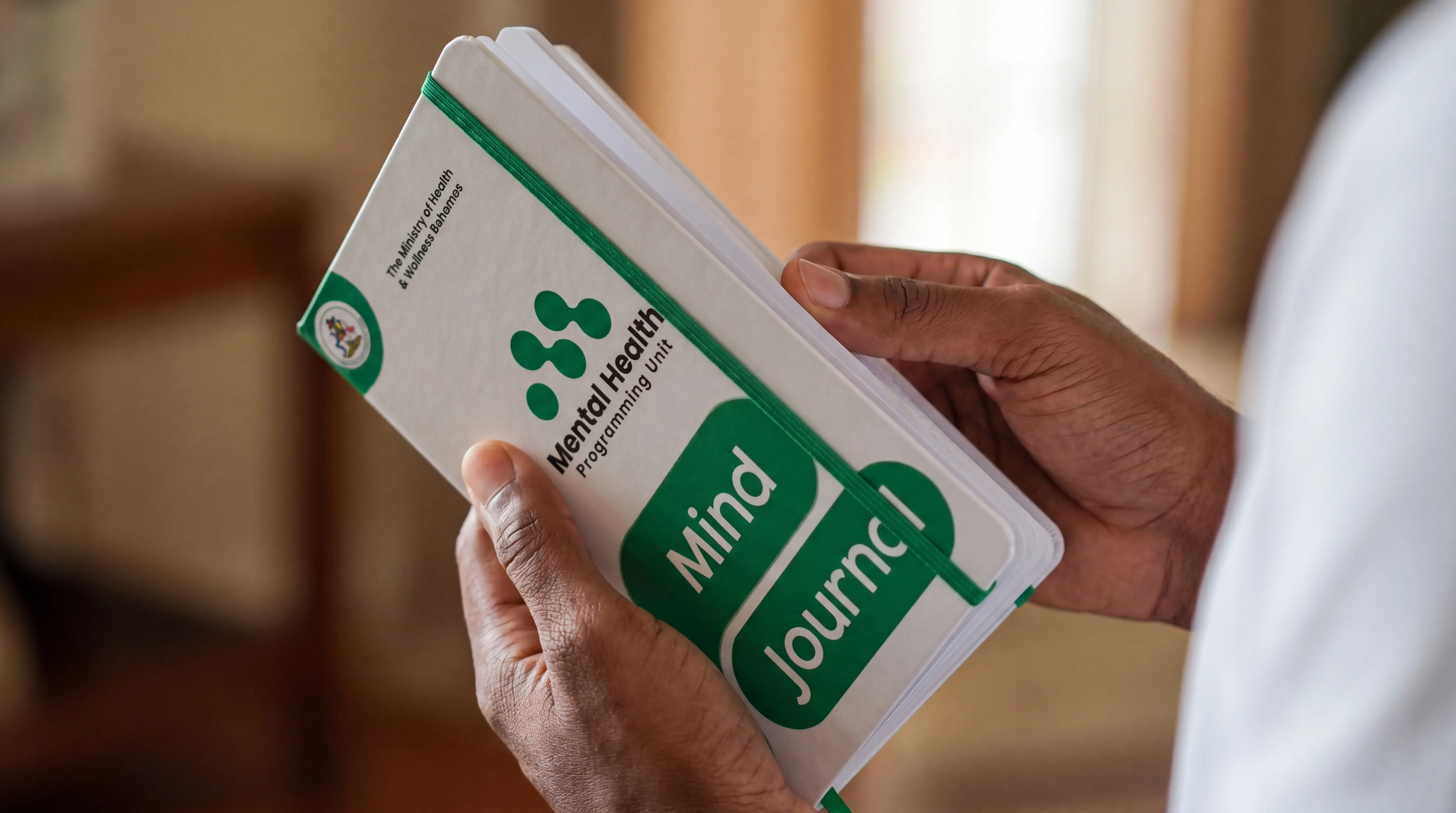

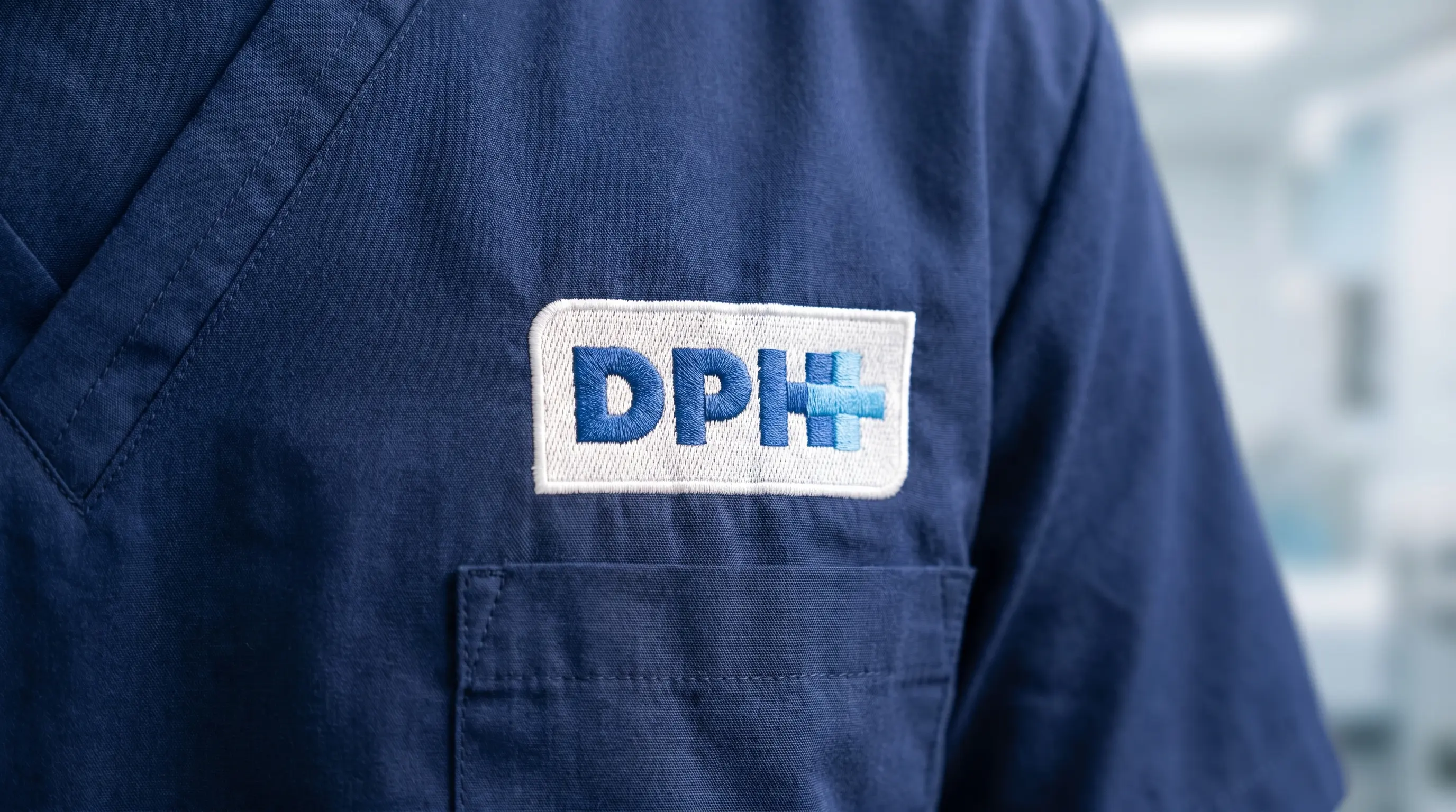
The logo system was built as a visual testament to connection. The design captures the essence of what the Mental Health Programming Unit does where the intricate threads of support, understanding, and empathy weave together to form a resilient and unified whole.
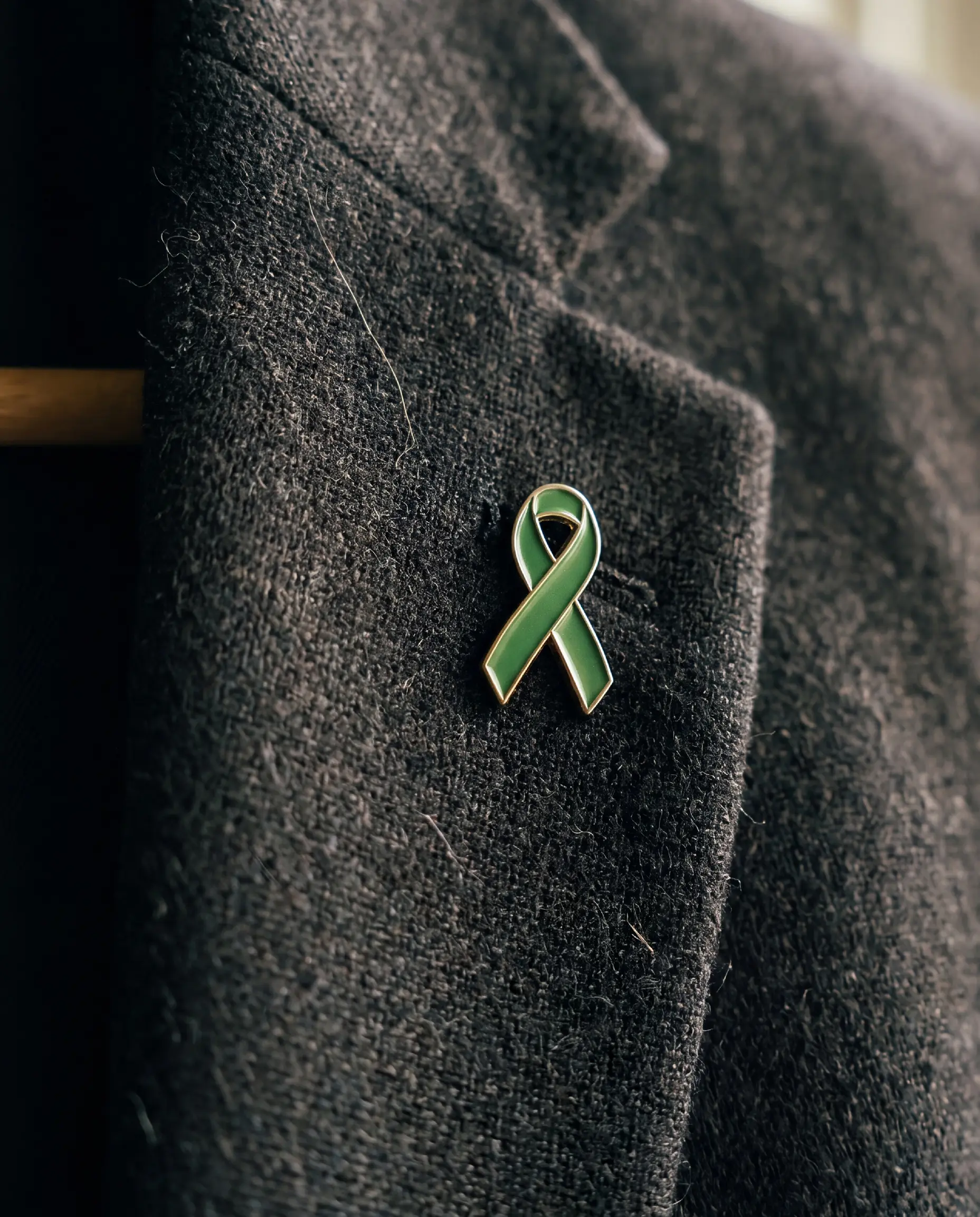
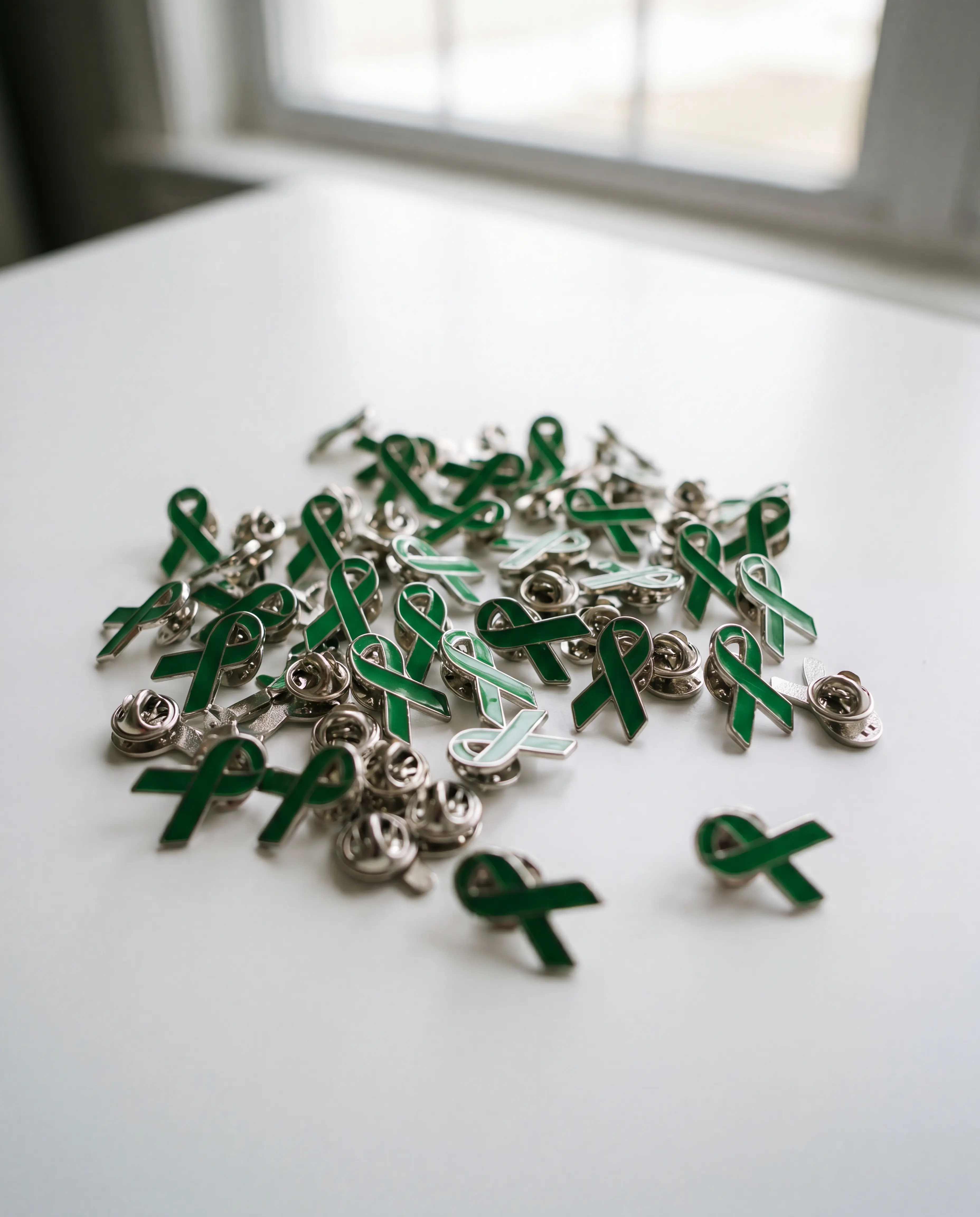
The color palette was meticulously chosen around meaning. Sea green evoking hope, tranquility, and calm anchored the system and aligned directly with the green ribbon, the internationally recognized symbol of mental health awareness. Complemented by Italian ice, the palette communicates a professional warmth that is calming without being sterile. Every color choice was deliberate, not decorative.
Brand in Motion
A brand for a mental health unit cannot just sit still on a business card. It needs to breathe. The motion work brought the identity to life across digital and event environments an animated logo reveal, a breathing animation that mirrored the calming techniques the unit promotes, and a Facebook page animation that extended the brand into the social spaces where the Bahamian community actually gathers.
Each motion piece was designed to carry the same emotional tone as the identity calm, connected, and reassuring.
The Event
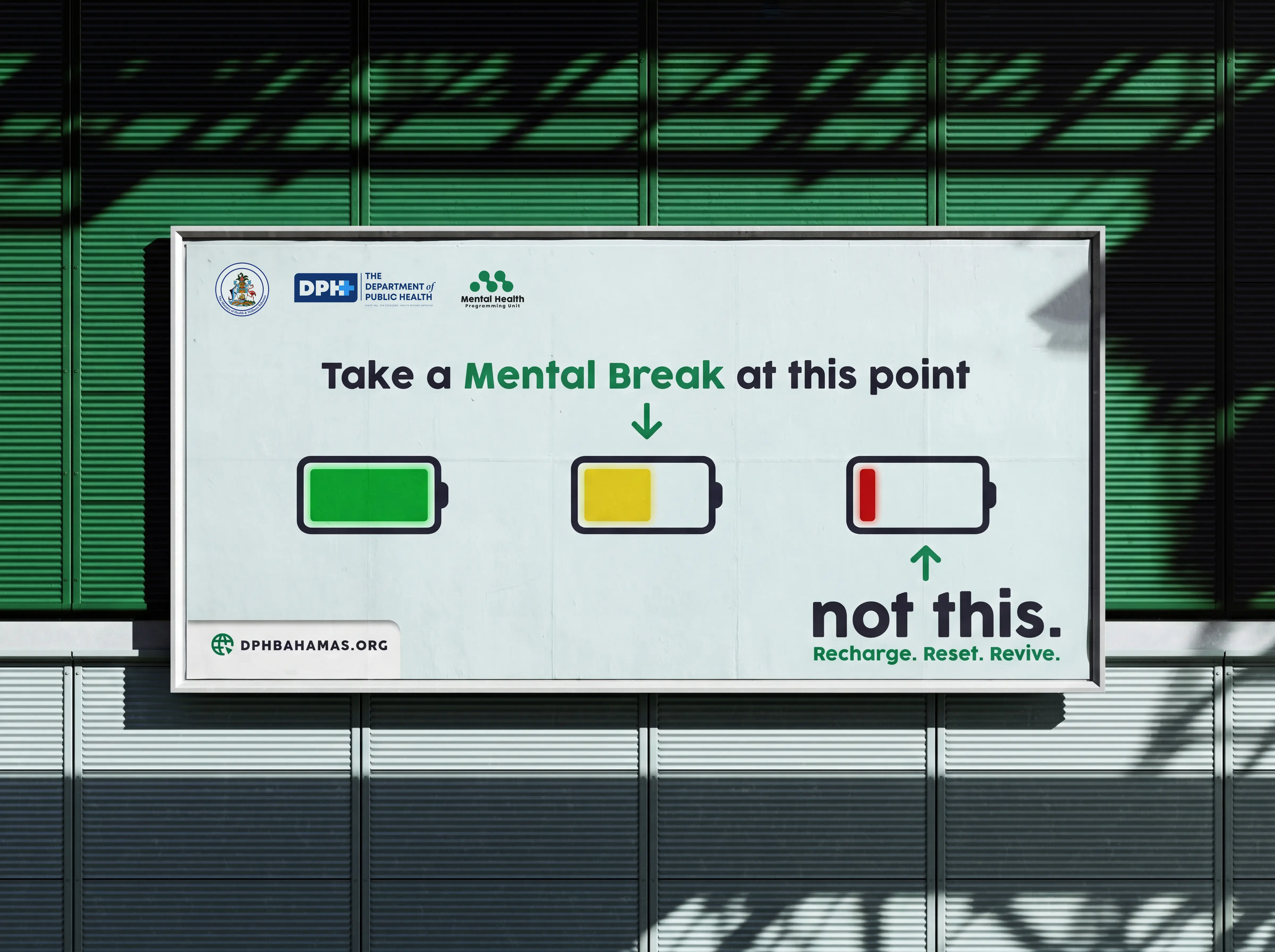
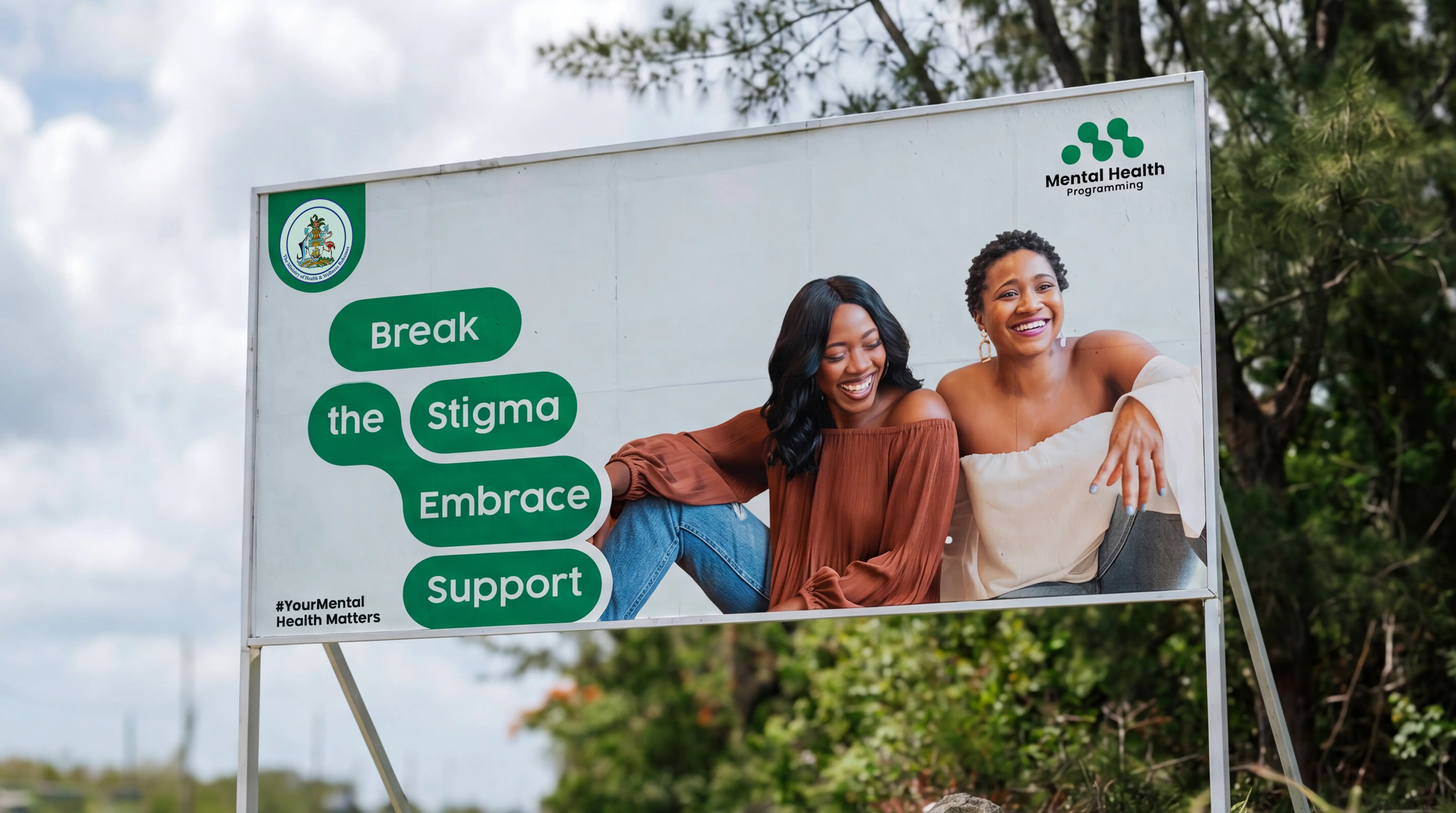
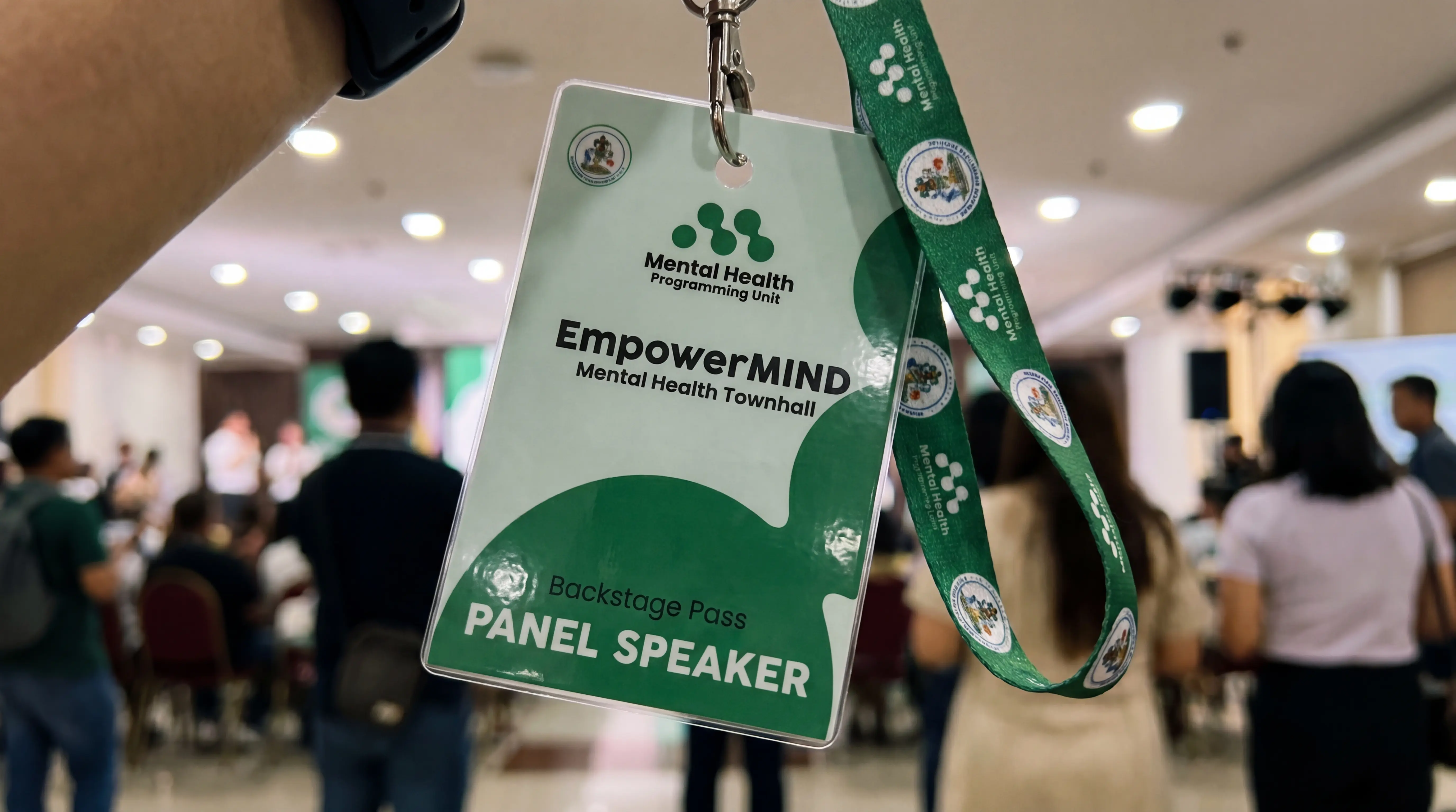
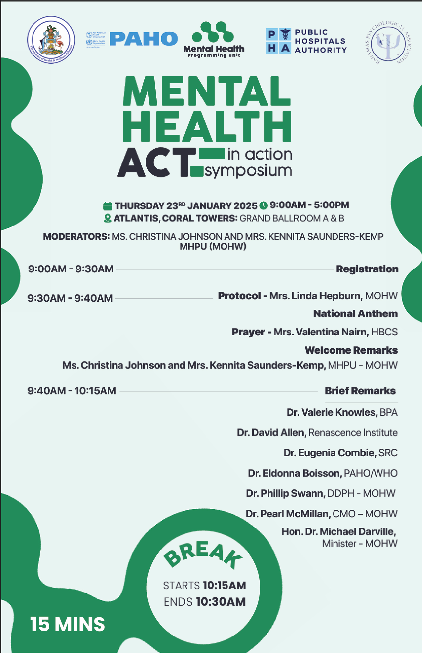
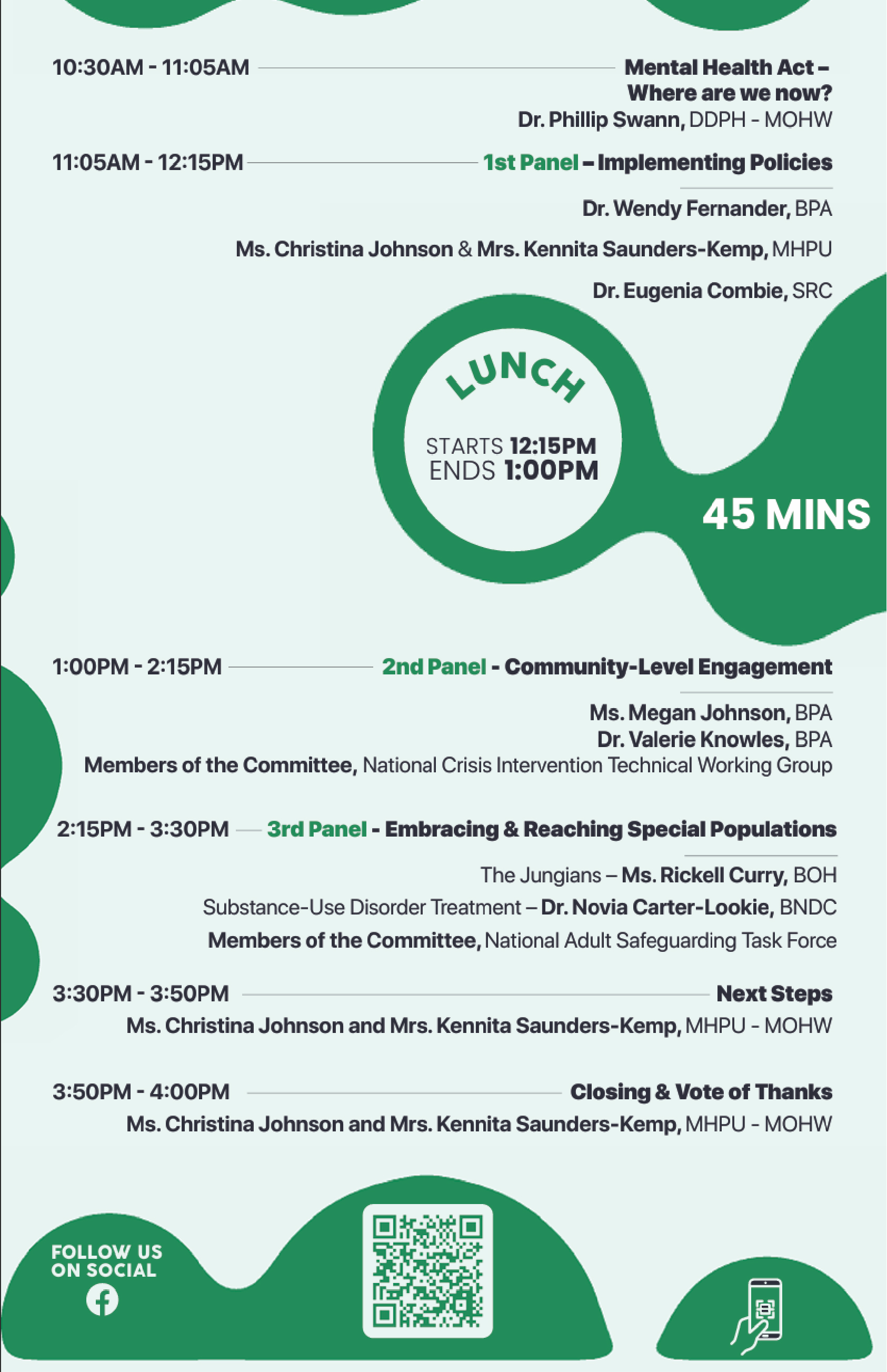
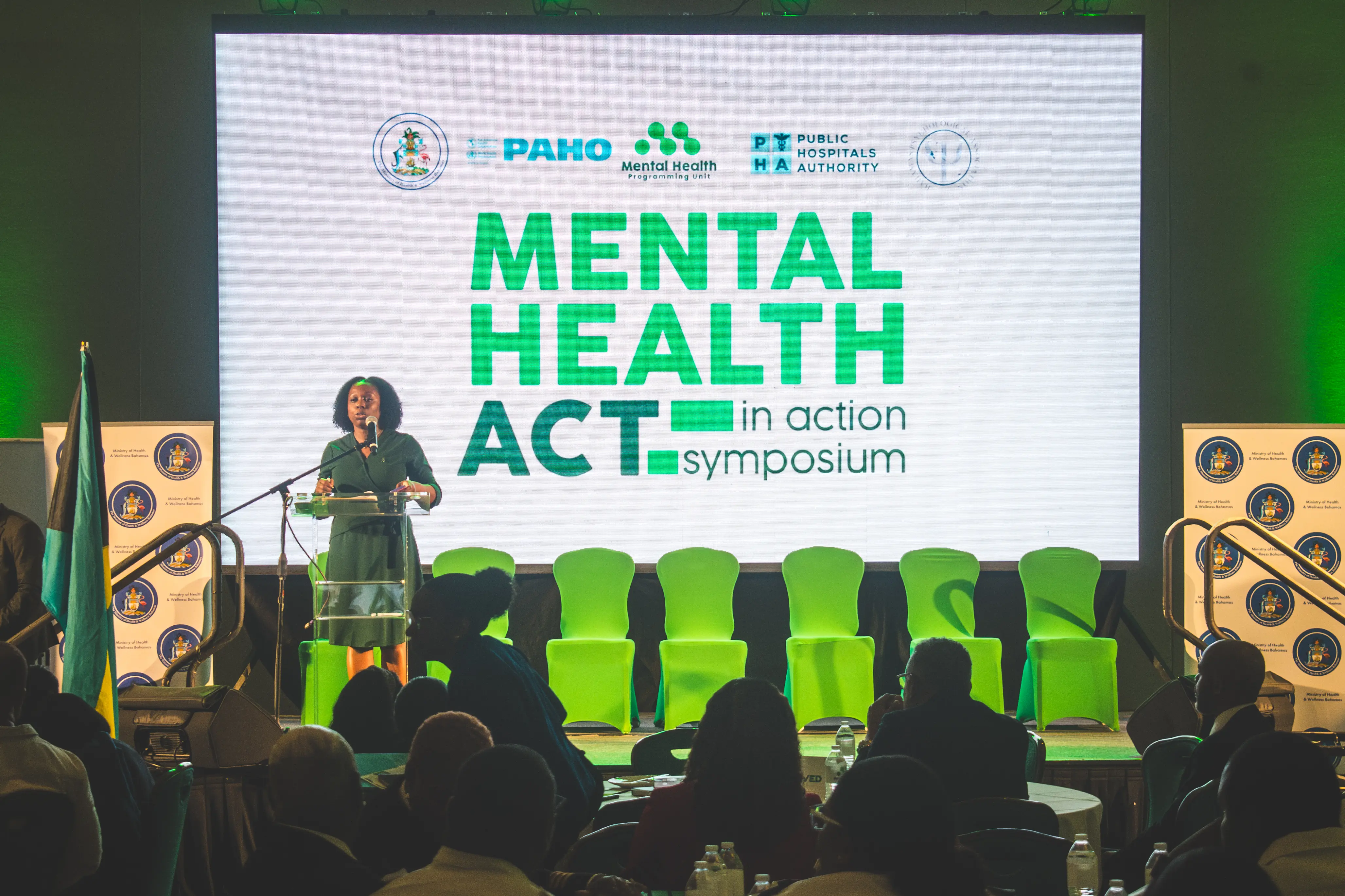
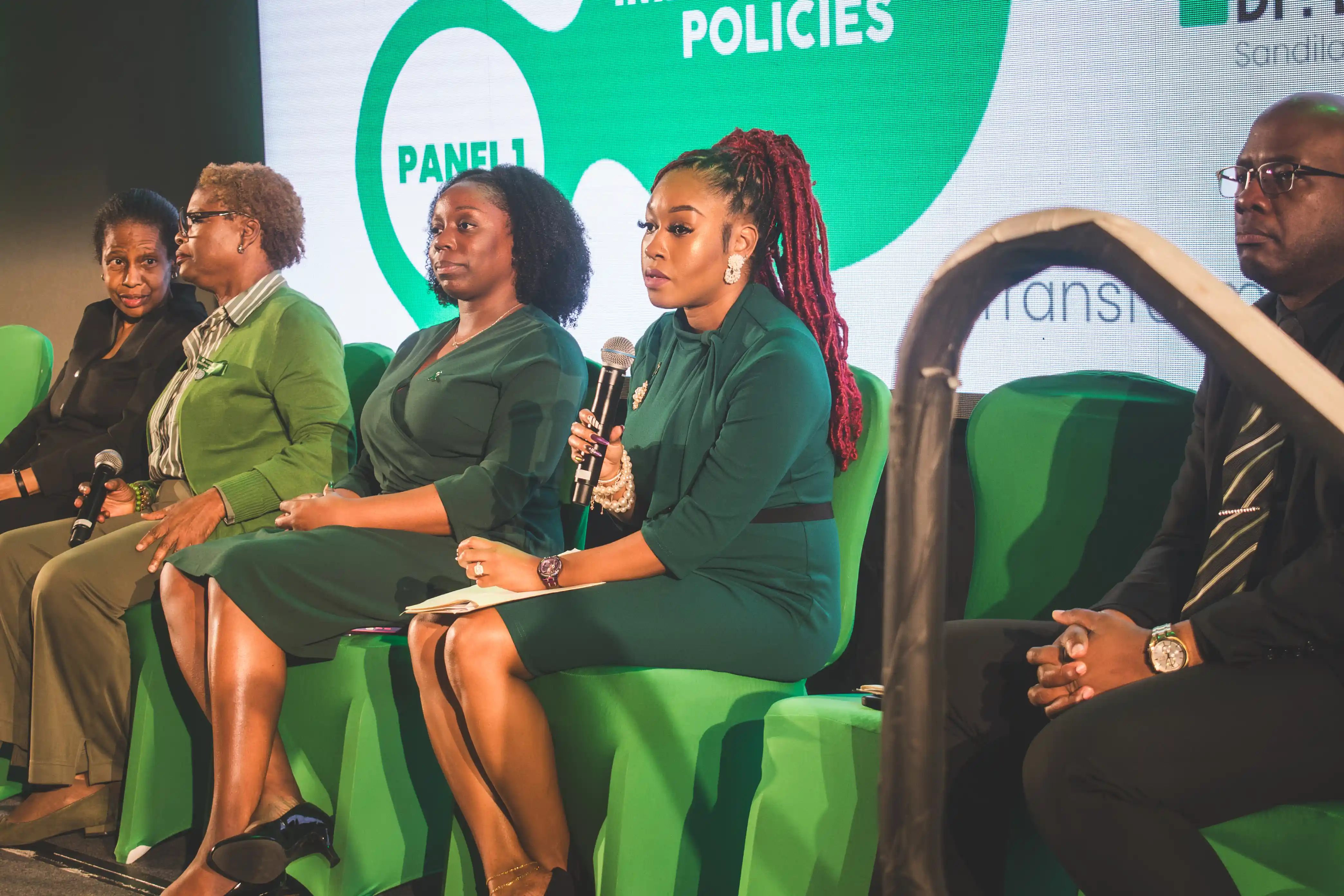
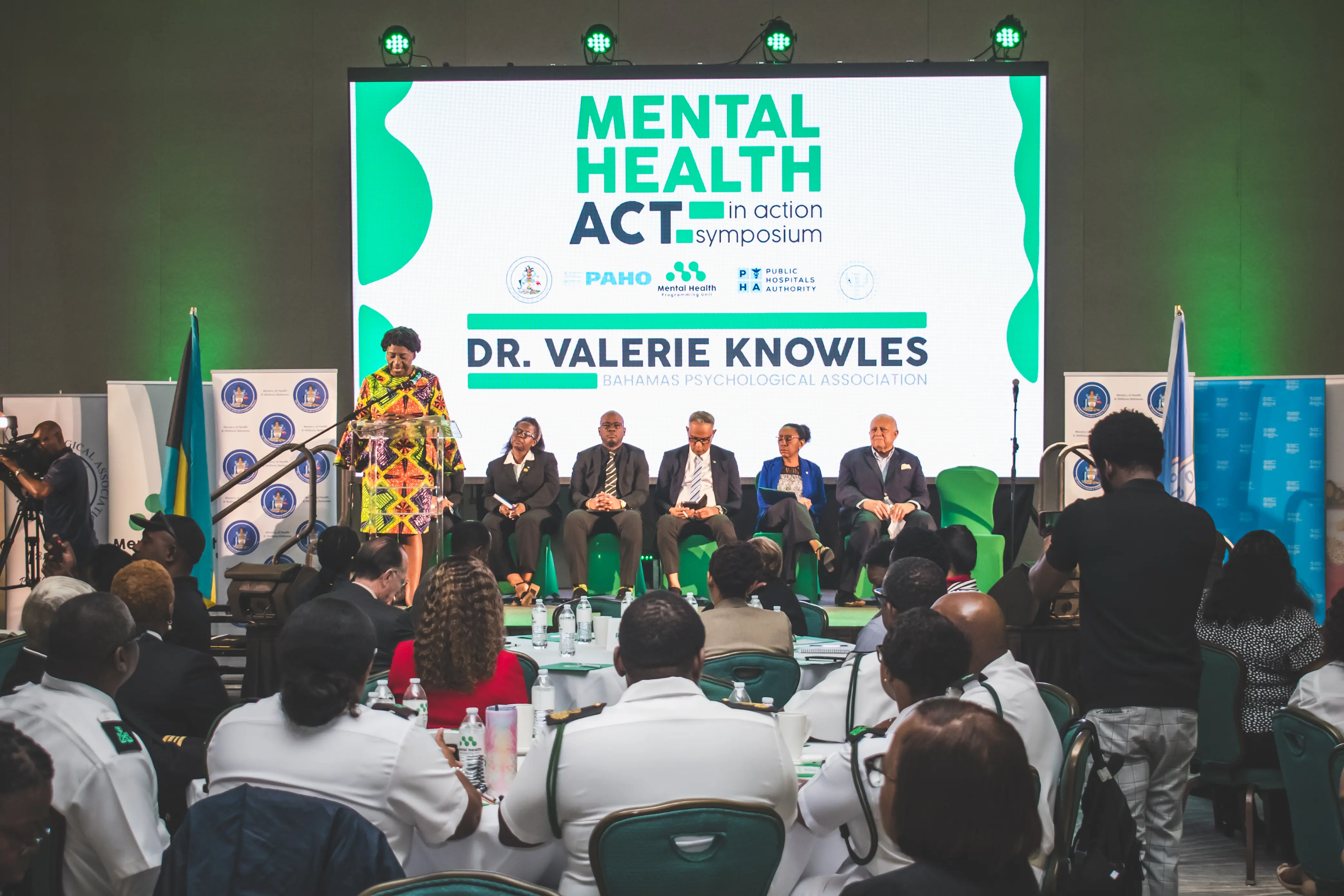
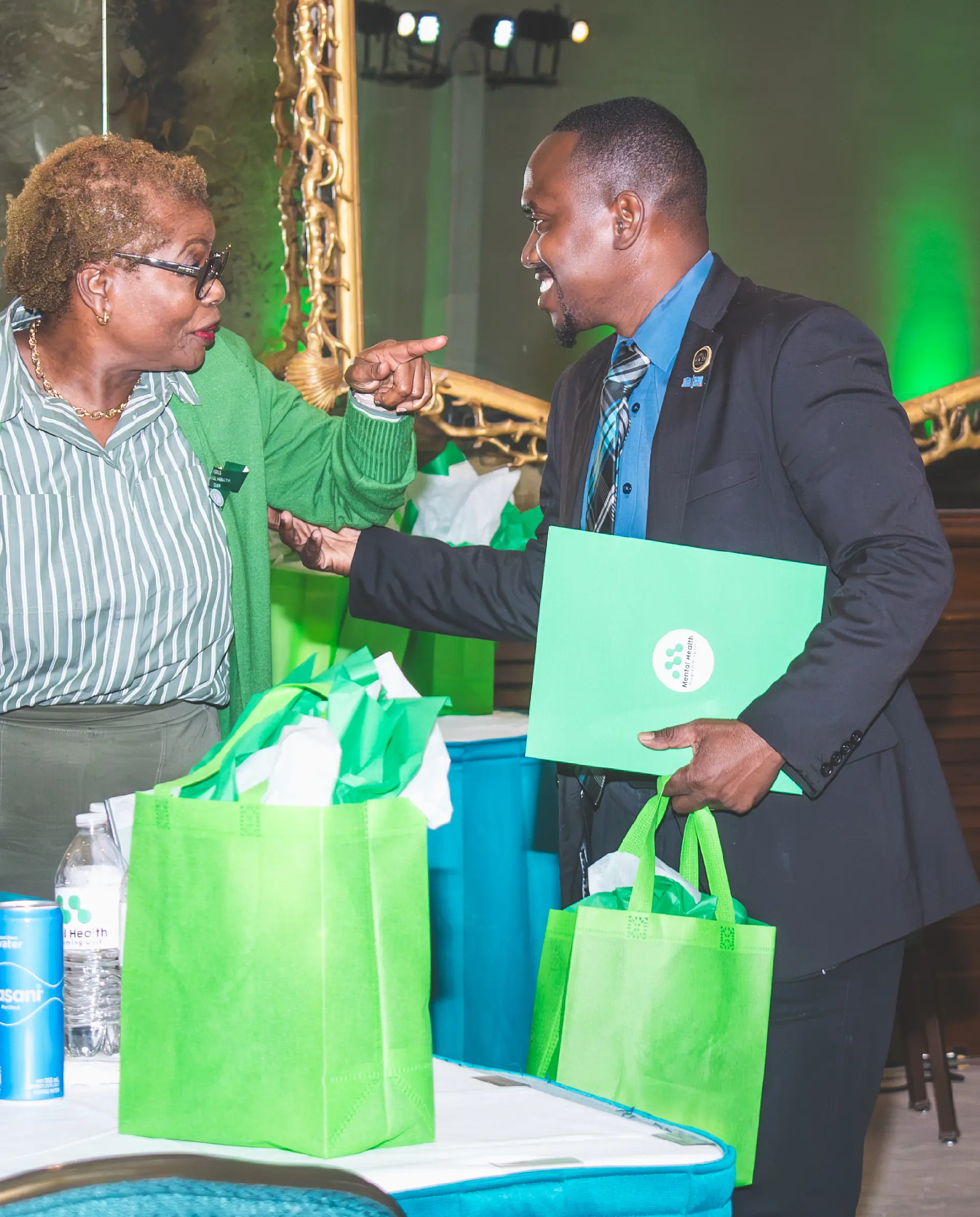
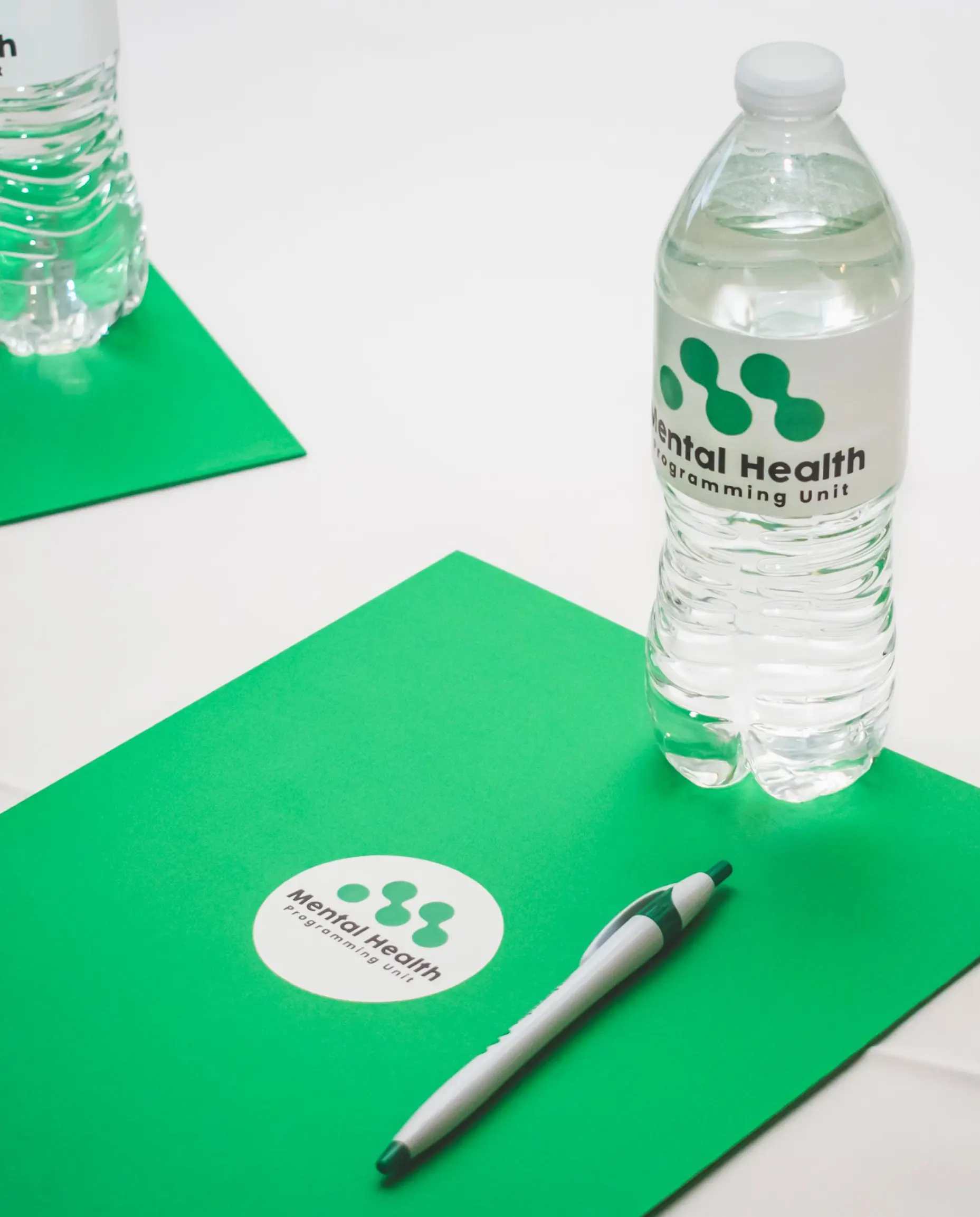
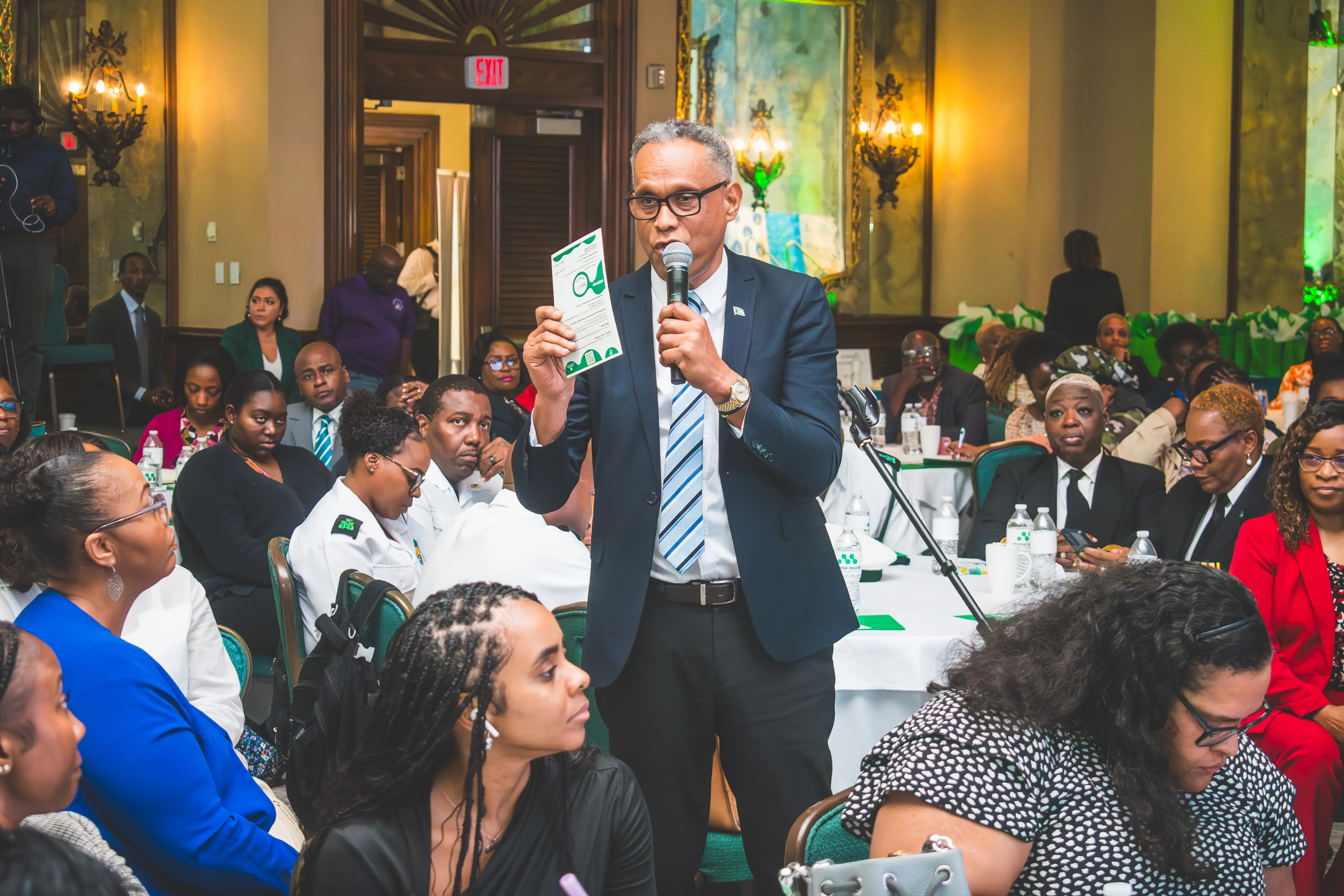
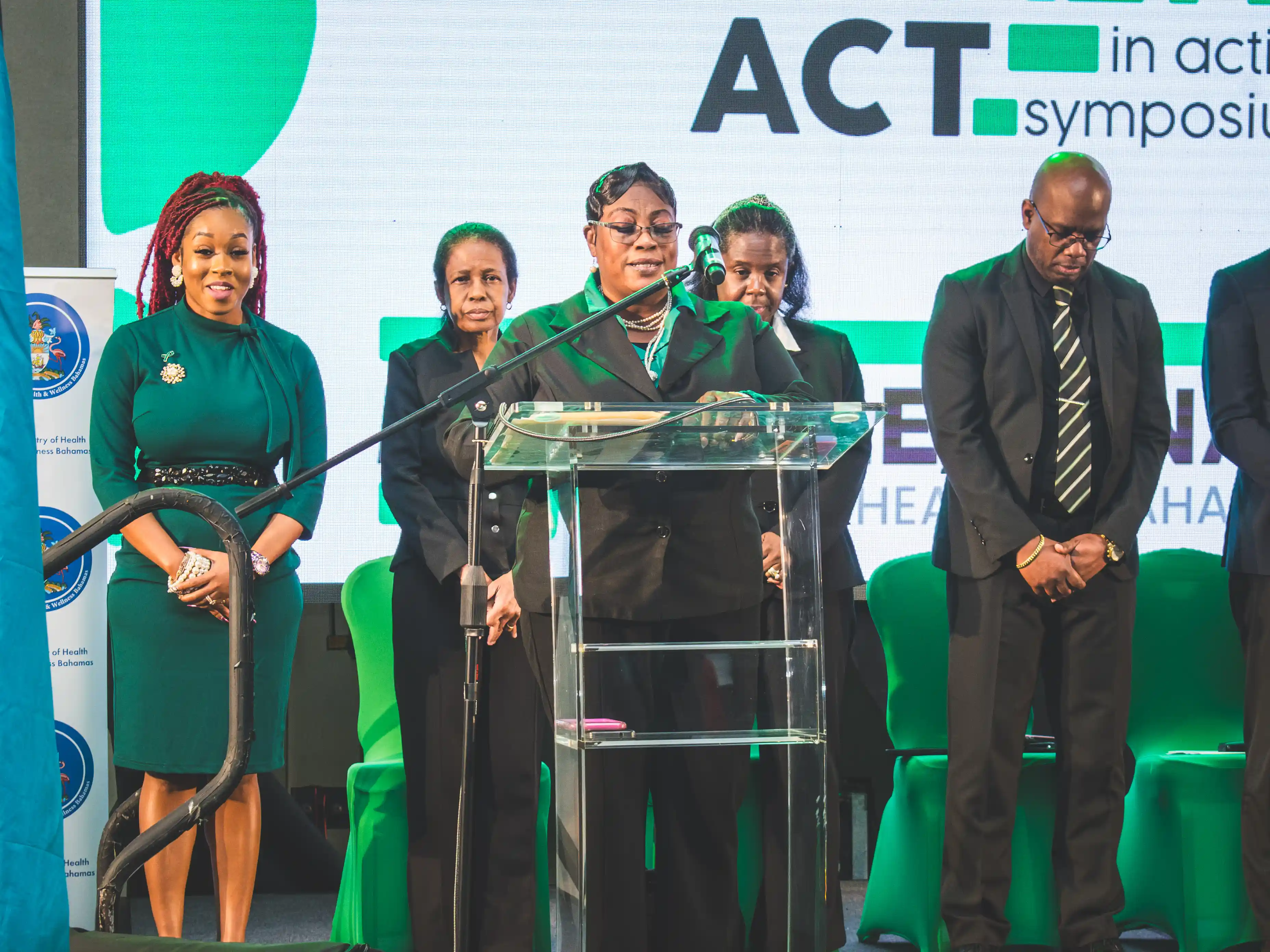
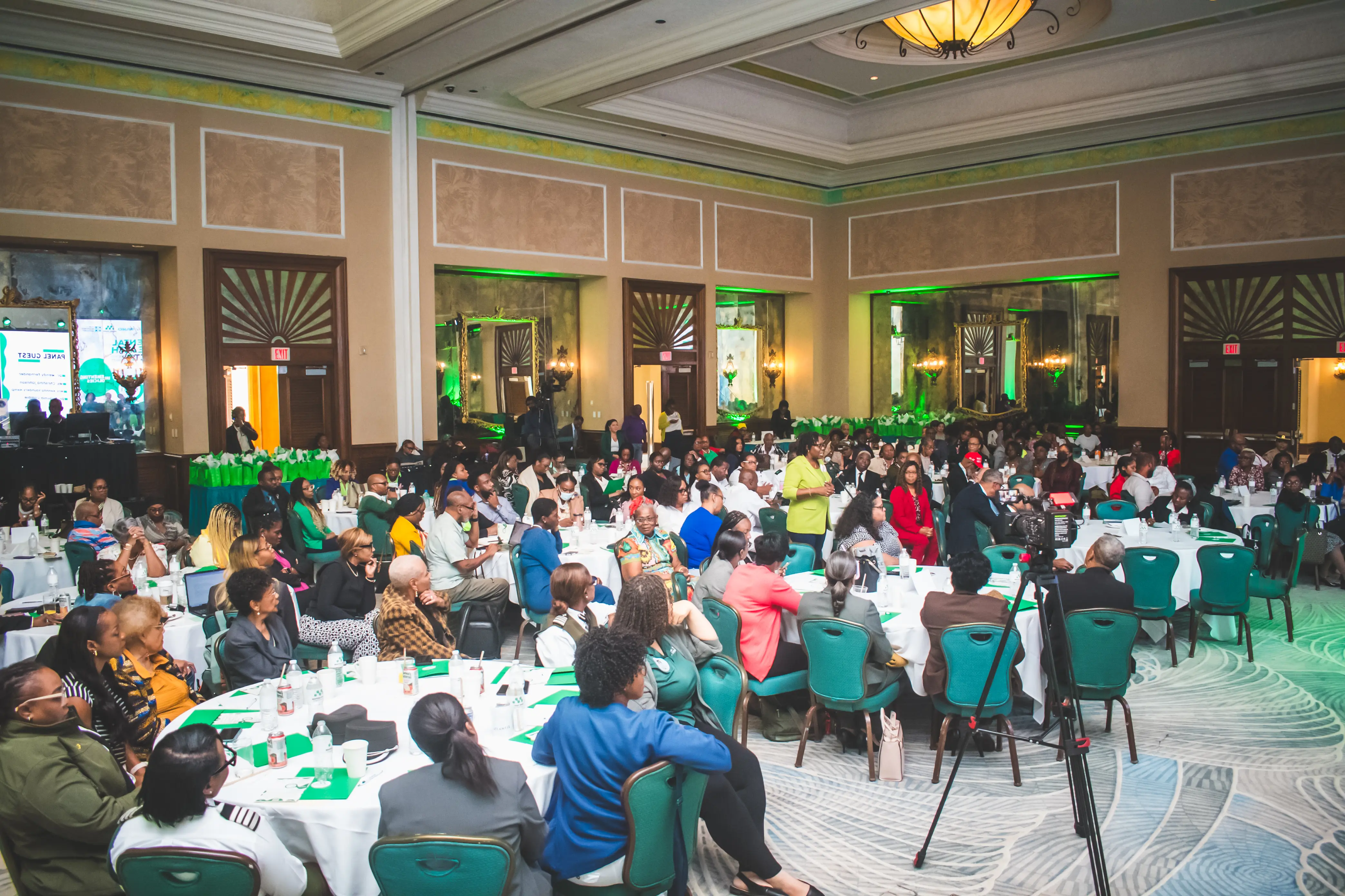
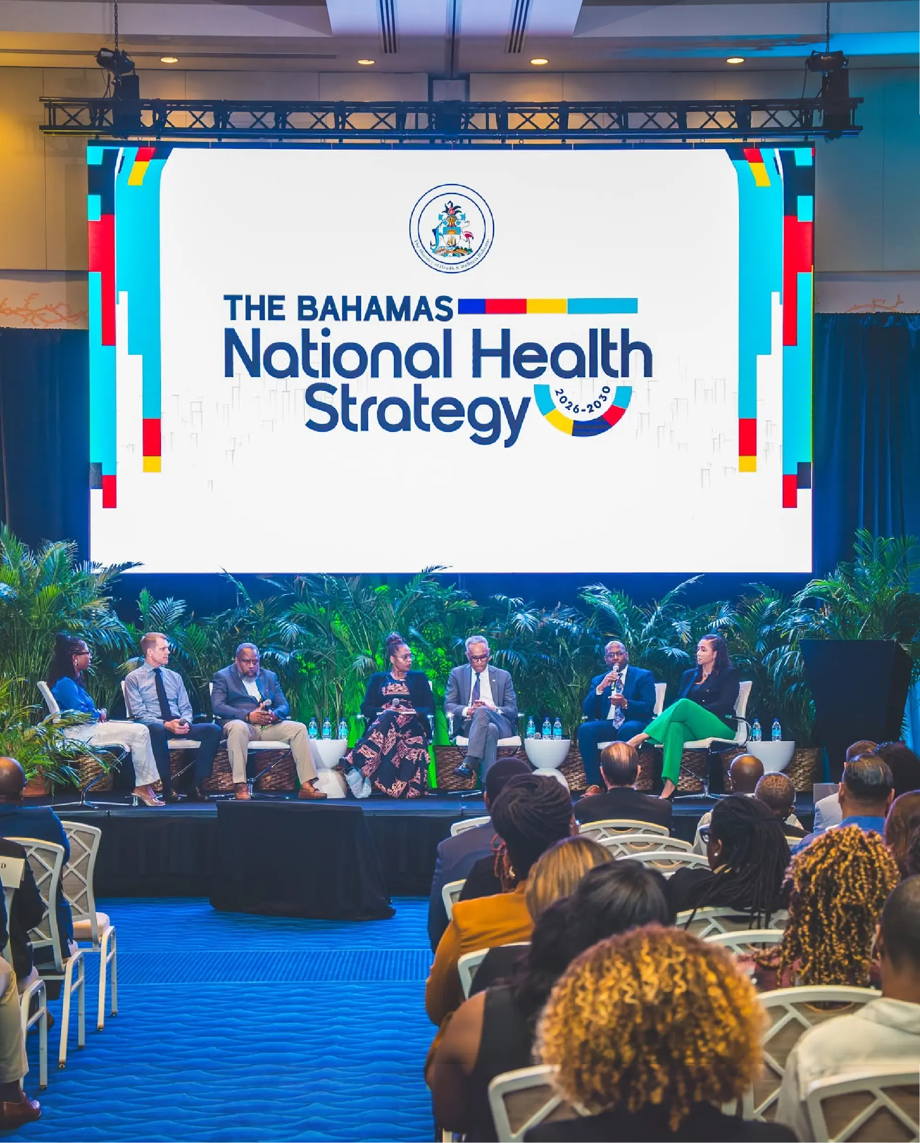
The brand extended into a full event experience motion graphics, intro loops, merch, and environmental design working together to create a space that felt as considered as the work being done inside it. The symposium brought together healthcare professionals, policymakers, and advocates to address key issues in mental health and wellness, marking a crucial step forward in efforts to integrate mental health into national policy frameworks and improve support networks for individuals and families across the Bahamas. The Brand Identity
The brand was there for all of it.
The Outcome
A brand system built not around what mental health looks like but around what it does. It connects. It teaches. It bridges gaps between people, between disciplines, between the physical and the emotional. The Mental Health Programming Unit now has a visual identity worthy of the work it carries one that can grow with the unit as mental health becomes an increasingly central part of the national conversation in the Bahamas.
"The brief was to avoid the obvious. The answer was to go deeper past the symbol and into the science of what mental health actually is. Connection. That became everything."
Creative Direction by Devante Butler
The unit needed a brand that could meet that moment. Not clinical. Not cold. Not the generic imagery of a brain or a head that mental health design so often defaults to. Something that felt human, approachable, and grounded in what mental health programming actually is at its core.
The Insight Everything Is Connection
After extensive research and deliberate design exploration, one theme emerged above everything else: connection.
Mental health programming is teaching. Teaching is connecting knowledge. The Ministry's work connects the gap between physical and mental health. Within mental illness itself, connections are everywhere perfectionism and anxiety intertwined, depression and negative thought patterns coalescing, stress and physical health bearing a direct relationship, substance abuse and coping mechanisms forming a crucial junction on the path to recovery. Even at the neurological level, thought itself is a cascade of connections between brain cells.
The fundamental objective of this unit is to foster and emphasize those connections within the organization, across leadership, among public workers, and throughout the entire Bahamian community. The brand was built around that truth.
The Identity
The logo system was built as a visual testament to connection. The design captures the essence of what the Mental Health Programming Unit does where the intricate threads of support, understanding, and empathy weave together to form a resilient and unified whole.
The color palette was meticulously chosen around meaning. Sea green evoking hope, tranquility, and calm anchored the system and aligned directly with the green ribbon, the internationally recognized symbol of mental health awareness. Complemented by Italian ice, the palette communicates a professional warmth that is calming without being sterile. Every color choice was deliberate, not decorative.
Brand in Motion
A brand for a mental health unit cannot just sit still on a business card. It needs to breathe. The motion work brought the identity to life across digital and event environments an animated logo reveal, a breathing animation that mirrored the calming techniques the unit promotes, and a Facebook page animation that extended the brand into the social spaces where the Bahamian community actually gathers.
Each motion piece was designed to carry the same emotional tone as the identity calm, connected, and reassuring.
The Event
The brand extended into a full event experience motion graphics, intro loops, merch, and environmental design working together to create a space that felt as considered as the work being done inside it. The symposium brought together healthcare professionals, policymakers, and advocates to address key issues in mental health and wellness, marking a crucial step forward in efforts to integrate mental health into national policy frameworks and improve support networks for individuals and families across the Bahamas. The Brand Identity
The brand was there for all of it.
The Outcome
A brand system built not around what mental health looks like but around what it does. It connects. It teaches. It bridges gaps between people, between disciplines, between the physical and the emotional. The Mental Health Programming Unit now has a visual identity worthy of the work it carries one that can grow with the unit as mental health becomes an increasingly central part of the national conversation in the Bahamas.
"The brief was to avoid the obvious. The answer was to go deeper past the symbol and into the science of what mental health actually is. Connection. That became everything."
Creative Direction by Devante Butler
dark
Outcome
The landing page improved first-screen comprehension and reduced friction in the path to sign up.
- +28% click-through on the primary CTA in the hero
- +19% time on page for visitors from ads
- −24% bounce on mobile
“Clean, fast, and exactly the tone we wanted. The new page finally explains Auralis without getting in the way.”
Services delivered
Website design, UI/UX design, visual direction, interaction design, design system setup, hand-off docs.
Tools
Figma for design and prototyping, Webflow for build, lightweight motion for micro-interactions.
.webp)
More Cases
.webp)